

Last Updated on September 29, 2026 by Joy Editors
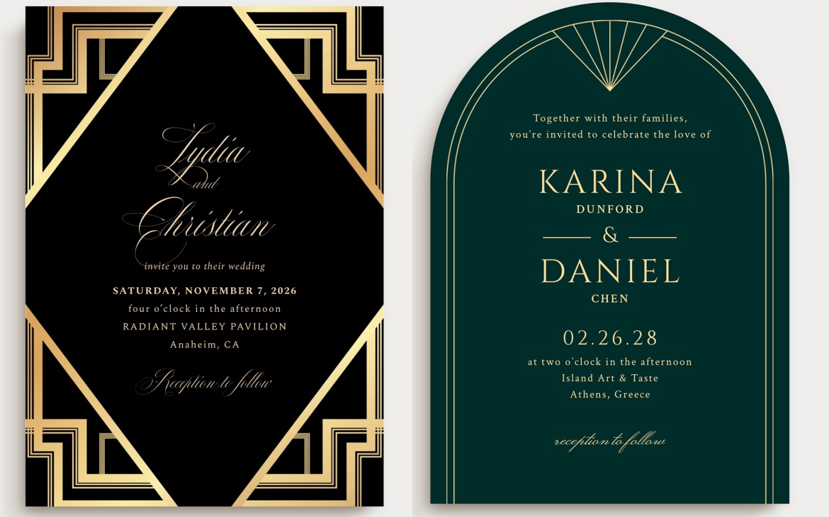
Art Deco wedding invitations use the bold geometry of the 1920s: sunburst rays, stepped arches, chevrons, and diamond frames, usually in metallic gold, silver, or rose gold against black, navy, emerald, or charcoal backgrounds. The look pairs naturally with a Great Gatsby or Roaring Twenties theme. Modern versions lighten the palette with blush or cream backgrounds and keep the same clean, angular lines for a subtler take on the style.
Art Deco is one of the few invitation styles that announces the entire wedding at a glance. A guest who opens a black and gold sunburst suite already knows the dress code leans formal, the venue leans glamorous, and the evening will probably involve champagne towers and a live band. This guide covers what defines the style, the colors and motifs to look for, real designs you can browse and customize today, and the wording and printing choices that make a Deco suite feel authentic rather than costume-like.
What Makes a Wedding Invitation “Art Deco”?
Art Deco design emerged in the 1920s and is defined by geometric symmetry, bold linework, and metallic accents rather than florals or curves. The look first hit the scene in the early 1920s, and it reached its peak in the architecture, posters, and jewelry of the Jazz Age. On paper, that history translates into straight lines, radiating patterns, and frames that feel engineered rather than hand-drawn.
It is worth separating Art Deco from Art Nouveau, the style it replaced. Art Nouveau favors flowing curves, vines, and organic floral shapes. Art Deco favors the opposite: straight lines, sharp angles, and repeated geometry. If an invitation looks like it could hang on the wall of a 1920s cinema palace, it is Deco.
The style also carries a built-in theme. Couples searching for Art Deco invitations are very often planning a Great Gatsby, Roaring Twenties, Jazz Age, or speakeasy wedding, and the invitation is the first place that theme gets communicated to guests.
Signature Colors and Motifs of Art Deco Invitations
Classic Palettes
The most common Art Deco wedding invitation palette pairs a dark background with a metallic foil or ink in gold, silver, or rose gold. The dark base does the dramatic work, and the metallic supplies the glamour.
- Black and gold: the definitive Gatsby combination, ideal for black-tie evening weddings.
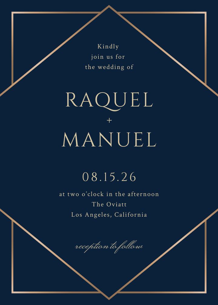
- Navy and gold: slightly softer than black, with the same formal weight.
- Charcoal and silver: cooler and more modern, well suited to a winter wedding.
- Emerald and gold: rich and jewel-toned, a strong fit for a vintage Hollywood or hotel-ballroom setting.
Modern Palettes
A current take on Art Deco invitations often swaps the traditional black background for a softer cream, blush, or dusty rose base while keeping the same angular linework. The geometry stays pure Deco, but the mood shifts from speakeasy to garden party.
- Cream and gold: warm and understated, works for daytime or evening.
- Blush and rose gold: romantic without losing the graphic edge.
- Dusty rose and charcoal: a modern mix of soft and structured.
Five Motifs to Look For
Sunbursts, fans, chevrons, stepped arches, and diamond frames are the five motifs that recur across nearly every Art Deco invitation design. Recognizing them makes it much easier to spot a true Deco design versus a generic geometric one.
- Sunburst: rays radiating from a central point, often framing the couple’s names.
- Fan motif: overlapping scalloped or pleated arcs, borrowed from 1920s jewelry and stage design.
- Chevron: repeated zigzag lines, usually as a border top and bottom.
- Stepped arch: stacked, receding arches that echo cinema-palace facades and skyscraper silhouettes.
- Diamond frame: an angular lozenge outline holding the invitation text.
Art Deco Wedding Invitation Designs to Shop Right Now
Every design below is a real, live invitation theme you can open, personalize, and send today, ordered from the boldest and darkest interpretations of the style to the lightest and most modern.

Deco Sunburst Silver
Charcoal background with radiating silver sunburst rays framing the names. The sunburst is the single most recognizable Art Deco motif, and this design is a direct callback to a Gatsby-era party poster.
Formal Deco
Deep navy background with a gold diamond-outline frame. This is the closest match to a black-tie Gatsby gala invitation in the collection, and it pairs naturally with a dress code line.
Soiree Gold
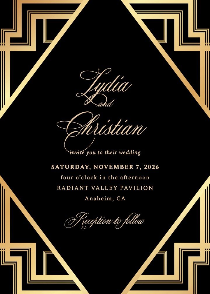
A black card with warm gold script inside a stepped geometric gold frame. The corner geometry is pure Deco, and the script keeps it romantic rather than severe.
Soiree Silver
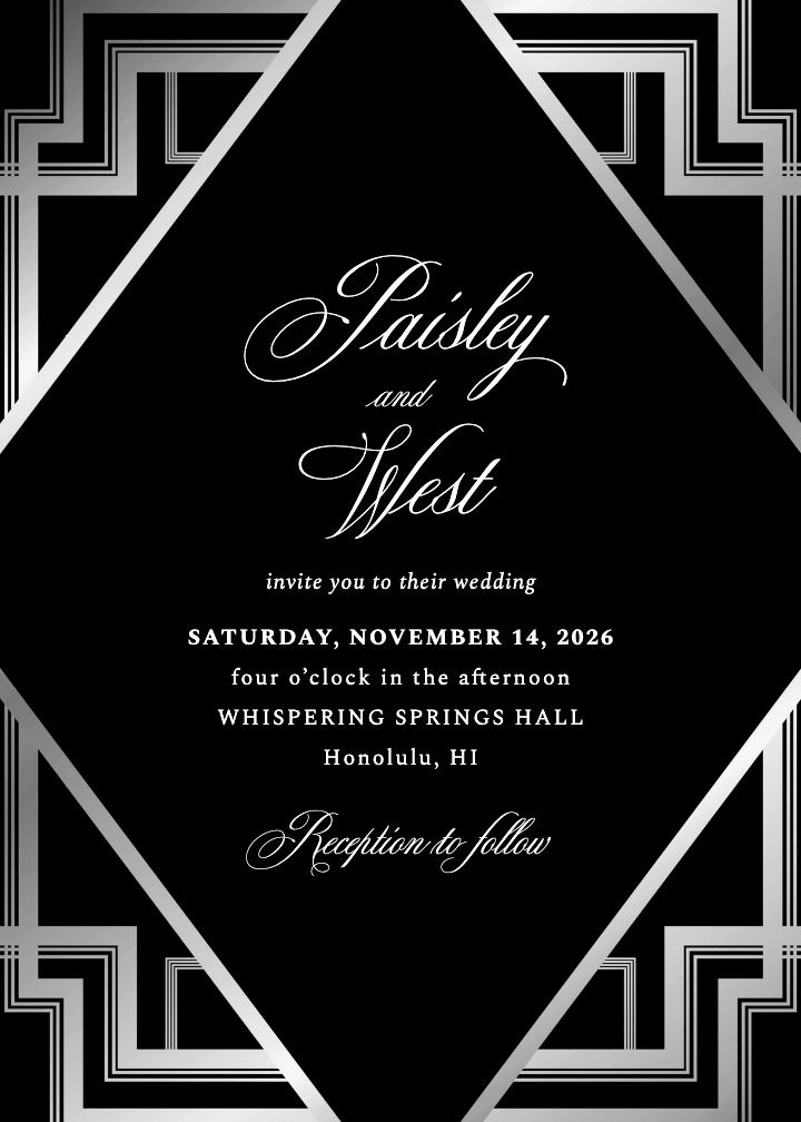
The same soiree layout in a black and silver colorway. The stepped silver frame gives it a cooler, more modern Deco reading for a winter or evening celebration.

Deco Moderne
Soft blush-cream background with a rose gold stepped diamond border. A lighter, forward-looking take on the same geometry, ideal for couples who want Deco without the dark palette.

Queens Palace
Deep navy with ornate gold filigree corner frames and a monogram crest. Formal and period-leaning, it suits a ballroom Gatsby wedding where the stationery should feel like an heirloom.

Chic Corners Black
Cream card with sharp black diagonal corner lines. The most minimal Deco option in the lineup, and a strong pick for a modern black-tie invitation.

Endless Time
A faceted charcoal-black geometric background with clean modern type. The crystalline geometry nods to Deco without any literal period motifs, a good bridge for couples who want drama with a current feel.
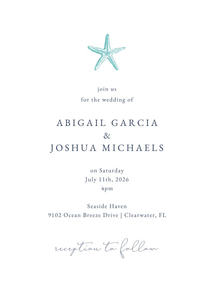
Captain Warren Abdul II
A single starfish motif over clean spaced type. Minimal Deco for a coastal or seaside venue, proof the style works far from the ballroom.
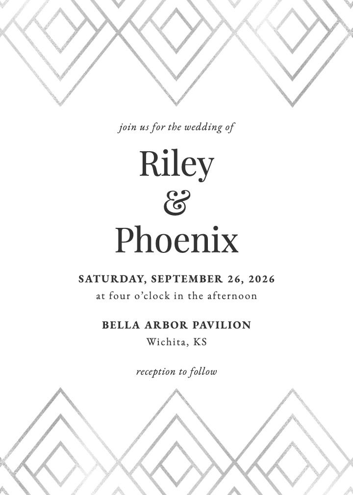
Silver Gatsby
A silver diamond chevron border top and bottom on white. The name says it outright: clean, formal Deco without any heaviness.
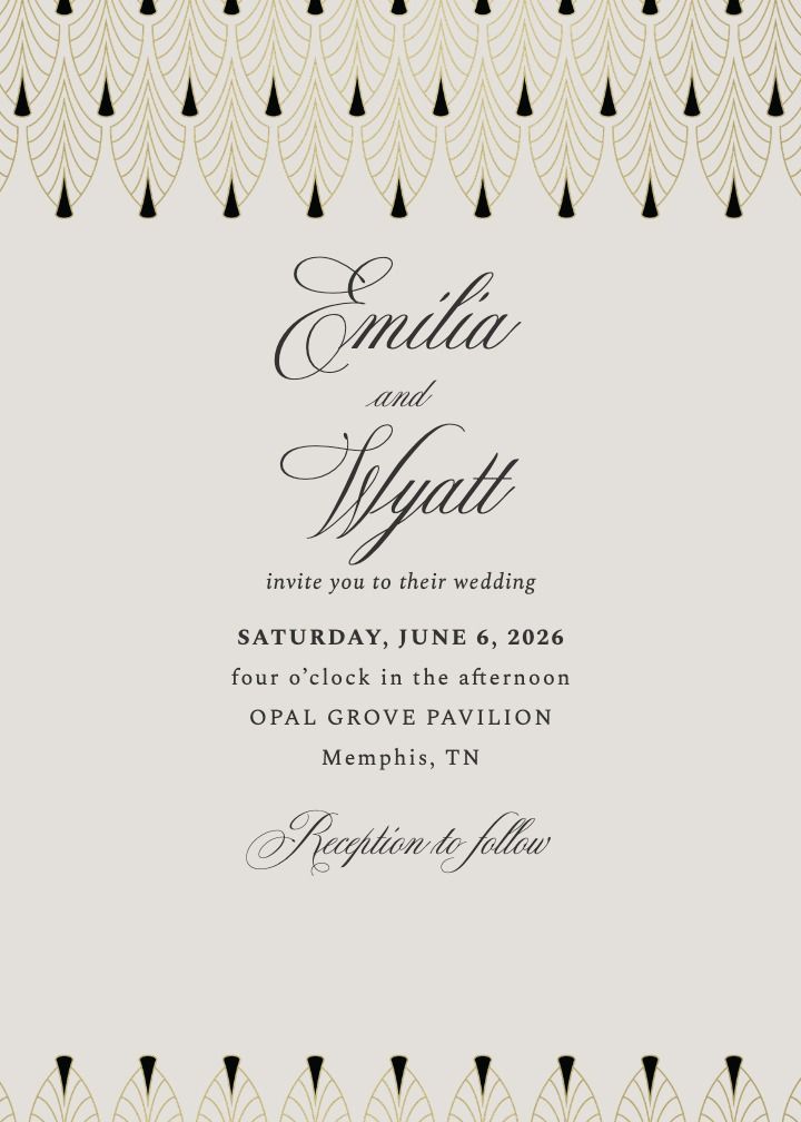
Chandelier Gold
Gold chandelier-fringe borders top and bottom, straight out of a Jazz Age ballroom. Formal script keeps it squarely in black-tie territory.
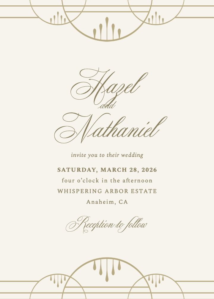
Palace
Stepped gold arches echo cinema-palace facades on a cream ground. Period glamour that stays light enough for a daytime ceremony.
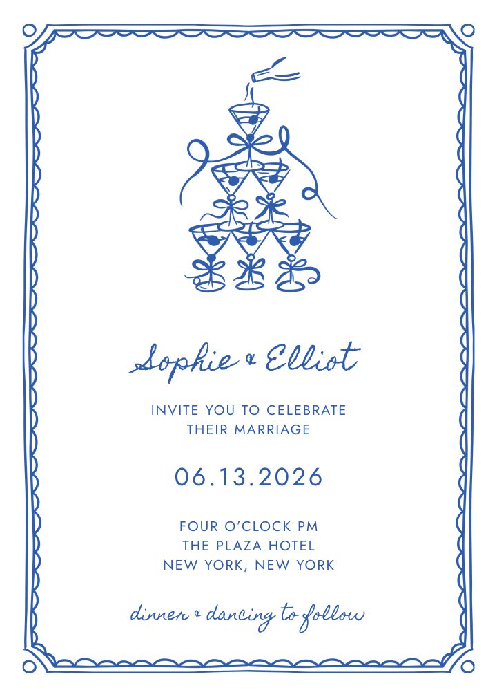
Gala
An illustrated champagne tower inside an ornamental border. The most literal Gatsby cue in the collection, made for a celebration that leans into the theme.
Paper, Foil, and Printing Choices
The finish you print on matters as much as the artwork for an Art Deco suite, because the style lives and dies on its metallic accents. Foil is the traditional route. Gold, silver, and rose gold foil stamping catch the light the way 1920s metalwork did, and foil pairs especially well with the dark backgrounds in the classic palettes.
- Foil stamping: the premium, most authentic Deco finish. Best for sunbursts, frames, and borders where the metallic needs to shine.
- Flat metallic-look ink: the budget-friendly alternative. Flat printing in metallic-look gold or silver ink still reads clearly as Art Deco.
- Letterpress or engraving: adds tactile depth to borders and monograms; engraving in particular has a long association with formal 1920s stationery.
- Paper stock: matte cardstock keeps dark backgrounds rich and fingerprint-free, while a thicker luxe stock gives stepped-arch and diamond-frame designs more presence in the hand.
Expect specialty finishes like foil and letterpress to add to both cost and production time compared with standard flat printing, so build that into the stationery timeline. The geometry and the metallic accent do the real work; the finish simply turns it up.
Wording That Fits an Art Deco or Gatsby Wedding
Formal phrasing tends to fit the Deco aesthetic best. Full names, a clear host line, and an explicit dress code note all reinforce the same Jazz Age formality the design is already signaling. A playful or casual tone can work, but it fights the geometry on the card.
A formal example in the classic structure:
Together with their families
Eleanor Margaret Hayes
and
Julian Alexander Cole
request the honor of your presence
at their wedding celebration
Saturday, the twentieth of June
at half past six in the evening
The Metropolitan Ballroom, Chicago
Black-tie attire
A few wording details pull the theme together. Spell out the date and time rather than using numerals, since numerals read modern while spelled-out phrasing reads period. Add the dress code line on the invitation itself rather than only on the website, because a Gatsby theme lives or dies on guests arriving in the right attire. Keep the same tone on the save-the-date and the RSVP card so the suite reads as one considered set.
Matching Save the Dates and the Rest of Your Wedding
An Art Deco invitation looks most intentional when the same motifs carry through everything else guests touch. Save-the-dates, RSVP cards, thank-you cards, menus, and programs in the same palette and linework make the theme feel designed rather than assembled. Pair the invitation with Art Deco save the date cards in the same style so the theme starts months before the invitation lands. Finishing touches like a gold envelope liner, a belly band, or a wax seal push a printed suite firmly into Jazz Age territory.
The theme can also extend past paper. Each invitation design pairs with a matching wedding website theme, so guests who visit for details land on a page that already looks like the invitation they received. When you set up a matching wedding website, the fonts, colors, and Deco motifs carry through automatically.
On the logistics side, a digital invitation option means you can track RSVPs as they come in instead of waiting on mailed-back response cards. Meal choices, plus-one names, and headcounts stay in one place, which matters for a formal seated reception where the caterer needs accurate numbers well before the big night.
Frequently Asked Questions
What makes a wedding invitation “Art Deco”?
It uses the geometric vocabulary of the 1920s: straight lines, symmetrical shapes, sunbursts, chevrons, and stepped arches, typically finished in a metallic gold, silver, or rose gold accent.
Is Art Deco the same as a Great Gatsby theme?
They overlap closely. Art Deco is the design movement; “Great Gatsby” or “Roaring Twenties” describes the party theme it usually decorates. Most Gatsby-themed invitations use Art Deco motifs.
What colors work best for an Art Deco invitation?
Black, navy, charcoal, and emerald are the classic dark backgrounds. Cream, blush, and dusty rose are popular lighter alternatives for a softer, more modern take on the style.
Do Art Deco invitations have to be printed with foil?
No. Foil (gold, silver, or rose gold) is traditional and adds shine, but flat-printed versions in the same metallic-look ink colors are common, more affordable, and still read as Art Deco.
What wording suits an Art Deco or Gatsby wedding invitation?
Formal phrasing tends to fit the aesthetic best: full names, a clear host line, and a dress code note (such as black-tie) if the celebration calls for one.
Explore More Art Deco Wedding Invitations
The lineup above covers the range from full Gatsby glamour to minimal geometry. Browse more Art Deco invitation designs and open any of them in the editor to see your own names and date set in the style.
Start Designing Your Art Deco Invitations
The fastest way to find your version of the style is to browse wedding invitation designs and open a few of the themes above in the editor, where you can swap colors, wording, and fonts before committing. If you plan to mail physical cards, the guide to getting started with printed cards walks through formats, paper, and ordering. And if Deco ends up competing with other era-inspired looks, these vintage-inspired invitation ideas are a good next stop.
Whichever direction you choose, let the invitation set the tone early. A strong Deco suite tells guests exactly what kind of night they are in for, and it gives them time to find the right flapper dress or bow tie to match.
