

Last Updated on September 29, 2026 by Joy Editors
Romantic wedding invitations set the tone for the entire celebration before a single guest arrives. They lean on softness and sentiment: watercolor blooms, flowing script, warm palettes, and small personal details that make the card feel like it could only belong to you two. Whether your venue is a garden, a vineyard, a ballroom, or a candlelit hall in winter, there is a romantic style that fits it.
Romantic wedding invitations share a few signatures: soft florals or watercolor artwork, flowing script typography, and a warm palette of blush, ivory, or deep moody tones. The style spans classic suites, fairy tale details, and modern minimal designs. With Joy, couples can send a romantic design on paper or digitally, matched to a free wedding website with built-in RSVP tracking.
This guide breaks down what actually makes an invitation feel romantic, showcases twelve named designs across four style directions, and covers the practical side: wording ideas, paper versus digital, timing, and how to carry one look from the envelope to your wedding website. If you want to start browsing now, you can explore the full gallery of wedding invitation designs and filter toward the soft, floral, and elegant looks that catch your eye.
12 Romantic Wedding Invitation Designs to Inspire You
The twelve designs below are organized by style direction: soft florals and watercolor, bold blooms, fairy tale and regal romance, and modern minimal romance. Each one is available as a printed card, a digital card, or both, and every design links to its page so you can preview it with your own names and date.
Soft Florals and Watercolor
This is the heart of the romantic category: painterly blooms, gentle washes of color, and compositions that feel like they were brushed onto the card by hand. These designs suit garden ceremonies, spring and summer dates, and any wedding where the flowers will do a lot of the talking.
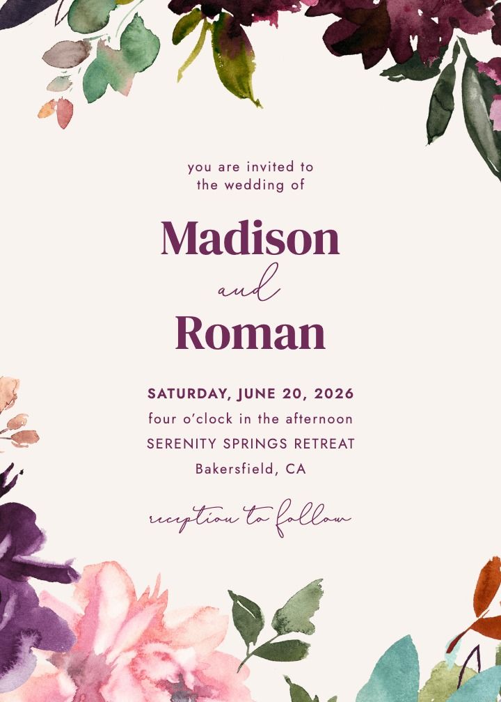
Romantic Florals
Lush watercolor blooms in reds and pinks gathered around classic typography. The saturated palette gives it enough presence for a formal celebration, while the loose brushwork keeps it warm rather than stiff. If you want the design guests will describe as so romantic without being able to say exactly why, start here.
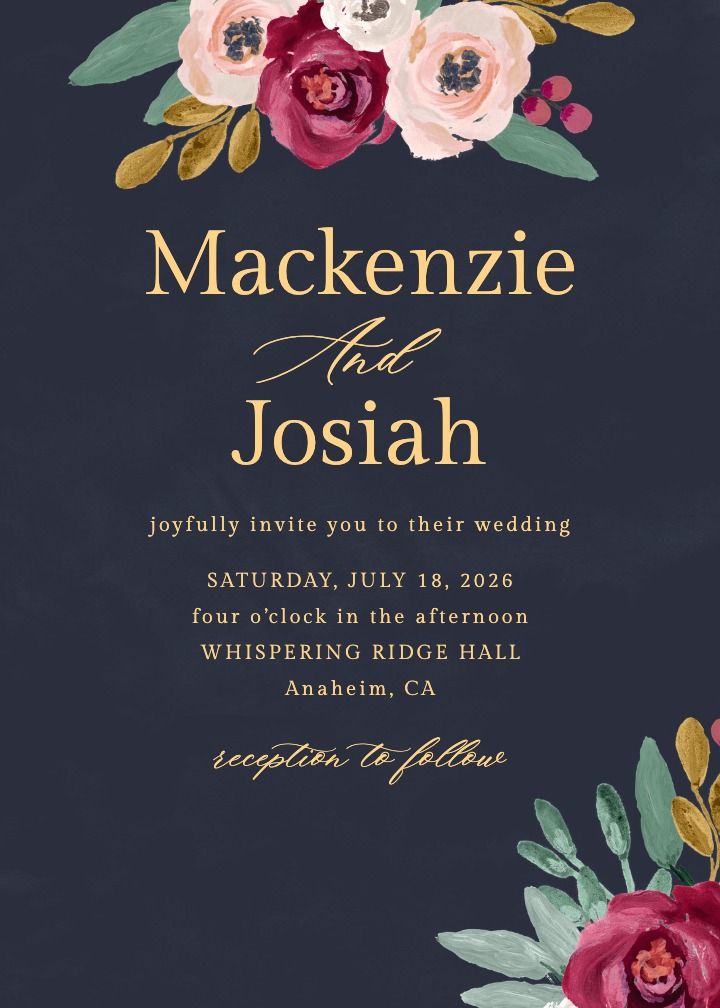
Fresh Bouquet
A just-picked bouquet rendered in loose watercolor, equal parts garden party and spring ceremony. Pair it with simple serif type and let the flowers carry the composition.
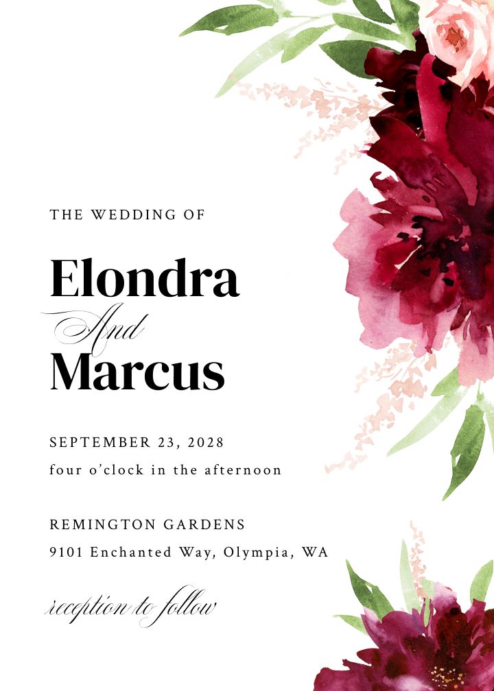
Elegant Flowers
Soft watercolor florals on a clean ground with plenty of white space. A gentle entry point into the romantic category for couples who want flowers without full saturation.
Bold Blooms and Dramatic Petals
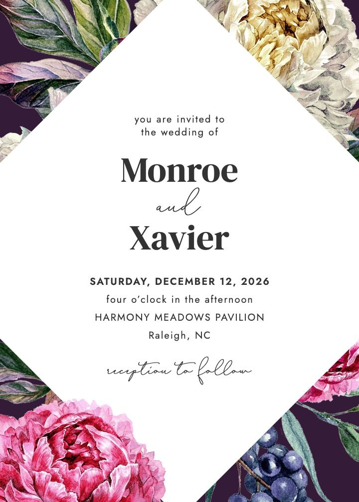
Dramatic Peonies
Oversized peony blooms in deep, moody tones. Choose this when the flowers should feel like the event: bold, confident, and a little theatrical. Strong choice for fall and evening weddings.
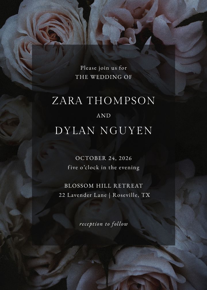
Rosebed
A full bed of roses rendered in rich, saturated color. It reads classic-romantic rather than vintage, and works well for ballroom and hotel venues.
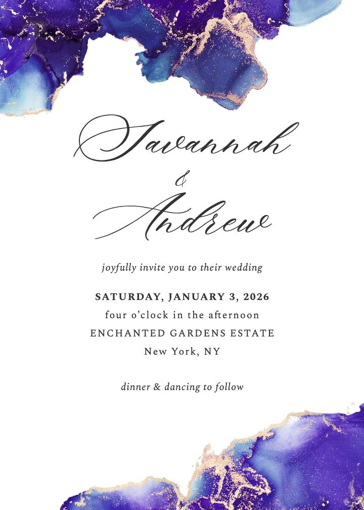
Amethyst Tidepool
Deep amethyst and violet tones pooling like watercolor. For couples who want drama in the palette without literal florals dominating the card.
Fairy Tale and Regal Romance
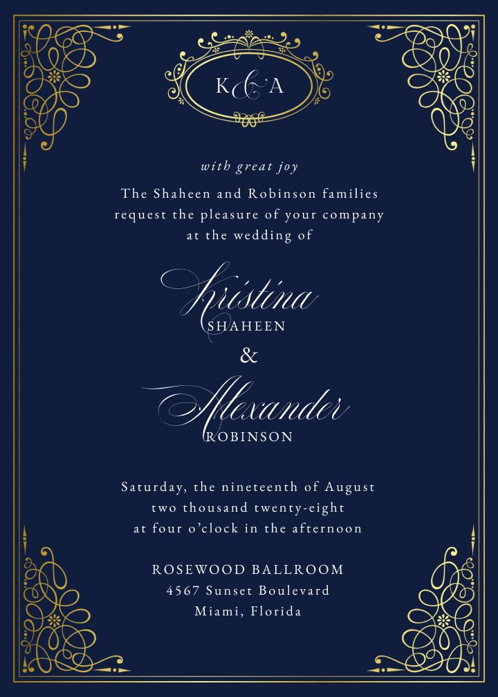
Queen’s Palace Foil
Regal navy and gold with real foil detailing. The most formal design in this set: palace ballrooms, black-tie dress codes, and couples who want the invitation to feel like an heirloom.
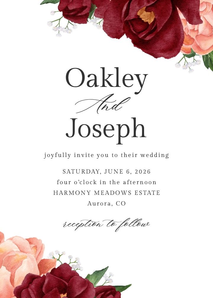
Wonderferris
A whimsical ferris-wheel motif with storybook charm. Best for couples leaning into the fairy-tale read: garden parties, estate weddings, and playful palettes.
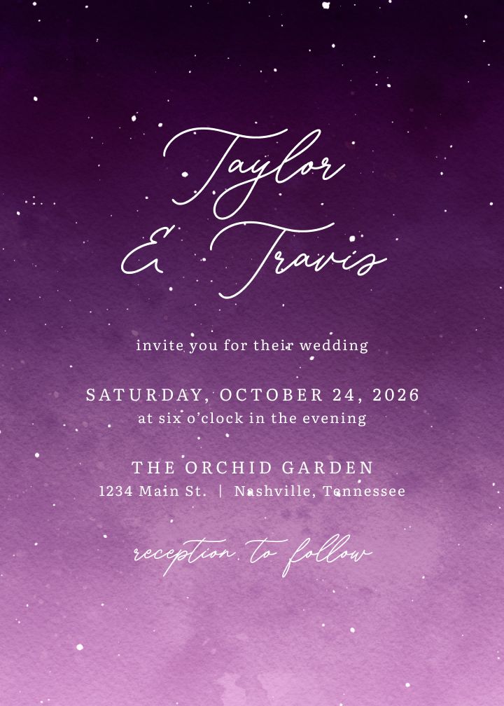
Enchanted
Soft illustrated romance with a dreamy, enchanted-forest feel. Pairs naturally with twilight ceremonies and candlelit receptions.
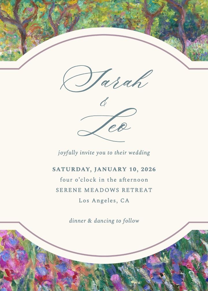
Artist’s Garden
Painterly garden florals with an art-school looseness. Romantic without being precious, and versatile across indoor and outdoor venues.
Modern and Minimal Romance
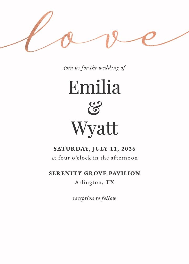
Love Script Rose
A single elegant script paired with one rose motif. Minimal but unmistakably romantic, and a strong fit for modern city venues and intimate weddings.
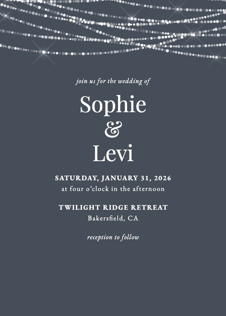
Strung In Love
Delicate string lights woven through the design. Romantic in a quiet, celebratory way: evening receptions, rooftop venues, and winter weddings.
What Makes a Wedding Invitation Romantic
Romance in stationery is a composition, not a price tag. An invitation feels romantic when a few specific elements work together, and understanding those elements helps you evaluate any design in any gallery. None of them require foil, laser cutting, or vellum overlays, though those embellishments can add texture if your budget allows.
Typography: Script Paired with Serif
Flowing calligraphy-style script is the fastest visual signal of romance. It suggests handwriting, intimacy, and a personal touch. The strongest designs pair one expressive script, usually for your names, with a clean serif for the logistical details, so the card stays readable while still feeling tender.
Watch the balance. An invitation set entirely in script is hard to read and can tip from romantic into fussy. One or two lines of script against quiet supporting type is the combination that endures.
Artwork: Florals, Watercolor, and Soft Illustration
Florals are the visual language of romantic stationery, and watercolor is their most common medium. Loose, painterly blooms feel hand-touched and warm, where crisp vector florals read more graphic and modern. Soft illustration, such as a sketched garden gate or a painted landscape, can carry the same mood for couples who want something less expected.
Palette: Blush, Ivory, and Moody Darks
The classic romantic palette runs warm and light: blush pink, dusty rose, ivory, cream, and soft gold. But romance also lives at the dark end of the spectrum. Deep navy, black, and burgundy backgrounds with rich blooms create a moodier, evening kind of romance that suits formal and winter celebrations.
Personal Details: Monograms, Quotes, and Shared Lines
The most romantic element on any invitation is the one only you two could have chosen. A monogram built from your initials, a line from a poem you both love, a lyric from your first dance: these small inclusions turn a beautiful template into your invitation. Look for designs that leave room for one personal line without crowding the card.
- Script typography for names, paired with a clean serif for details.
- Watercolor or illustrated florals rather than sharp, graphic blooms.
- Warm palettes like blush, ivory, and dusty rose, or deep moody tones for evening romance.
- One personal detail such as a monogram, a quote, or a line that means something to you.
- Generous white space so the design breathes and the sentiment lands.
ypography: Script Paired with Serif
Flowing calligraphy-style script is the fastest visual signal of romance. It suggests handwriting, intimacy, and a personal touch. The strongest designs pair one expressive script, usually for your names, with a clean serif for the logistical details, so the card stays readable while still feeling tender.
Watch the balance. An invitation set entirely in script is hard to read and can tip from romantic into fussy. One or two lines of script against quiet supporting type is the combination that endures.
Artwork: Florals, Watercolor, and Soft Illustration
Florals are the visual language of romantic stationery, and watercolor is their most common medium. Loose, painterly blooms feel hand-touched and warm, where crisp vector florals read more graphic and modern. Soft illustration, such as a sketched garden gate or a painted landscape, can carry the same mood for couples who want something less expected.
Palette: Blush, Ivory, and Moody Darks
The classic romantic palette runs warm and light: blush pink, dusty rose, ivory, cream, and soft gold. But romance also lives at the dark end of the spectrum. Deep navy, black, and burgundy backgrounds with rich blooms create a moodier, evening kind of romance that suits formal and winter celebrations.
Personal Details: Monograms, Quotes, and Shared Lines
The most romantic element on any invitation is the one only you two could have chosen. A monogram built from your initials, a line from a poem you both love, a lyric from your first dance: these small inclusions turn a beautiful template into your invitation. Look for designs that leave room for one personal line without crowding the card.
- Script typography for names, paired with a clean serif for details.
- Watercolor or illustrated florals rather than sharp, graphic blooms.
- Warm palettes like blush, ivory, and dusty rose, or deep moody tones for evening romance.
- One personal detail such as a monogram, a quote, or a line that means something to you.
- Generous white space so the design breathes and the sentiment lands.
Typography: Script Paired with Serif
Flowing calligraphy-style script is the fastest visual signal of romance. It suggests handwriting, intimacy, and a personal touch. The strongest designs pair one expressive script, usually for your names, with a clean serif for the logistical details, so the card stays readable while still feeling tender.
Watch the balance. An invitation set entirely in script is hard to read and can tip from romantic into fussy. One or two lines of script against quiet supporting type is the combination that endures.
Artwork: Florals, Watercolor, and Soft Illustration
Florals are the visual language of romantic stationery, and watercolor is their most common medium. Loose, painterly blooms feel hand-touched and warm, where crisp vector florals read more graphic and modern. Soft illustration, such as a sketched garden gate or a painted landscape, can carry the same mood for couples who want something less expected.
Palette: Blush, Ivory, and Moody Darks
The classic romantic palette runs warm and light: blush pink, dusty rose, ivory, cream, and soft gold. But romance also lives at the dark end of the spectrum. Deep navy, black, and burgundy backgrounds with rich blooms create a moodier, evening kind of romance that suits formal and winter celebrations.
Personal Details: Monograms, Quotes, and Shared Lines
The most romantic element on any invitation is the one only you two could have chosen. A monogram built from your initials, a line from a poem you both love, a lyric from your first dance: these small inclusions turn a beautiful template into your invitation. Look for designs that leave room for one personal line without crowding the card.
- Script typography for names, paired with a clean serif for details.
- Watercolor or illustrated florals rather than sharp, graphic blooms.
- Warm palettes like blush, ivory, and dusty rose, or deep moody tones for evening romance.
- One personal detail such as a monogram, a quote, or a line that means something to you.
- Generous white space so the design breathes and the sentiment lands.
ypography: Script Paired with Serif
Flowing calligraphy-style script is the fastest visual signal of romance. It suggests handwriting, intimacy, and a personal touch. The strongest designs pair one expressive script, usually for your names, with a clean serif for the logistical details, so the card stays readable while still feeling tender.
Watch the balance. An invitation set entirely in script is hard to read and can tip from romantic into fussy. One or two lines of script against quiet supporting type is the combination that endures.
Artwork: Florals, Watercolor, and Soft Illustration
Florals are the visual language of romantic stationery, and watercolor is their most common medium. Loose, painterly blooms feel hand-touched and warm, where crisp vector florals read more graphic and modern. Soft illustration, such as a sketched garden gate or a painted landscape, can carry the same mood for couples who want something less expected.
Palette: Blush, Ivory, and Moody Darks
The classic romantic palette runs warm and light: blush pink, dusty rose, ivory, cream, and soft gold. But romance also lives at the dark end of the spectrum. Deep navy, black, and burgundy backgrounds with rich blooms create a moodier, evening kind of romance that suits formal and winter celebrations.
Personal Details: Monograms, Quotes, and Shared Lines
The most romantic element on any invitation is the one only you two could have chosen. A monogram built from your initials, a line from a poem you both love, a lyric from your first dance: these small inclusions turn a beautiful template into your invitation. Look for designs that leave room for one personal line without crowding the card.
- Script typography for names, paired with a clean serif for details.
- Watercolor or illustrated florals rather than sharp, graphic blooms.
- Warm palettes like blush, ivory, and dusty rose, or deep moody tones for evening romance.
- One personal detail such as a monogram, a quote, or a line that means something to you.
- Generous white space so the design breathes and the sentiment lands.
12 Romantic Wedding Invitation Designs to Inspire You
The twelve designs below are organized by style direction: soft florals and watercolor, bold blooms, fairy tale and regal romance, and modern minimal romance. Each one is available as a printed card, a digital card, or both, and every design links to its page so you can preview it with your own names and date.
Soft Florals and Watercolor
This is the heart of the romantic category: painterly blooms, gentle washes of color, and compositions that feel like they were brushed onto the card by hand. These designs suit garden ceremonies, spring and summer dates, and any wedding where the flowers will do a lot of the talking.
Romantic Invitation Wording: Quotes, Poems, and Personal Lines
The most common wording mistake on a romantic invitation is reaching for a famous quote that could appear on anyone’s card. Maya Angelou and Johnny Cash lines are beautiful, but they are also on thousands of invitations every year. The more romantic move is to adapt classic phrasing so it sounds like you.
The structure stays the same regardless of style: your names, the date, the ceremony time, the venue, and where to RSVP. Romance lives in one or two expressive lines around those essentials, not in crowding the card with verse. For a deeper walkthrough of hosts, request lines, and reception details, see this guide to wedding invitation wording.
Classic Formal
Together with their families, Amelia Rose Bennett and James Henry Cole request the honor of your presence as they exchange vows and begin their forever, Saturday, the twentieth of June, two thousand twenty-six, at four o’clock in the afternoon, Rosewood Gardens, Napa, California.
The romance here comes from cadence and one added phrase: “begin their forever.” Everything else follows the traditional formal pattern, so the single expressive line stands out instead of competing with decoration.
Modern Heartfelt
After seven years, two cities, and one very patient dog, Mia Torres and Daniel Okafor are getting married. Join them on August 8, 2026, at Willow Creek Barn, Hudson Valley, New York. Dinner, dancing, and happy tears to follow.
This version earns its romance through specificity. A small true detail about your relationship does more than any borrowed quote, and guests will remember it. Keep the logistics in a clean typeface below the expressive opening.
Whimsical Fairy Tale
Once upon a time, two people swiped right, and every chapter since has been better than the last. Sofia Marchetti and Alexander Whitmore invite you to celebrate their happily ever after, October 3, 2026, at Ashford Estate, Allentown, New Jersey.
The fairy tale register works best when it acknowledges itself with a light touch. One playful line up top, formal details below, and the card balances charm with clarity.
Paper, Digital, or Both
Romance comes from the design, not the medium. A well-composed digital invitation with soft florals and elegant typography sets the same tone as a printed card, and the strongest approach for most couples is a hybrid: printed invitations for the formal mailing, matching digital versions for re-sends, last-minute additions, and updates.
The hybrid solves real problems. A guest moves and the printed card goes to an old address: resend digitally in the same design. You add a few names after the mailing: no second print run. Plans shift and the venue changes: one update reaches everyone instead of a correction card. When the design also extends to a matching wedding website, guests move from envelope to RSVP page without the look ever breaking.
Here is how the main routes compare on the things that matter for a romantic suite:
| Option | Paper Invitations | Matching Digital | Matching Website | Online RSVP Tracking | Typical Price Position |
|---|---|---|---|---|---|
| Joy | Yes, printed cards in every design | Yes, same design as a digital card | Yes, free and in the same design | Yes, built into the guest list | Accessible |
| Boutique stationery studio | Yes, often with premium finishes | Rarely, usually a separate vendor | No, a separate service entirely | No, paper reply cards | Premium boutique |
| Print-on-demand marketplace | Yes, wide template selection | Sometimes, as a separate product | No | No, paper reply cards | Budget to mid-range |
The practical difference shows up after the invitations go out. With paper reply cards, you tally responses, meal choices, and plus-ones by hand. When you track RSVPs online against your guest list, responses collect themselves, and you can nudge the stragglers as the deadline approaches instead of chasing reply cards through the mail.
Matching Your Invitations to the Rest of Your Wedding Stationery
The romantic first impression should not stop at the invitation. Save the dates, the wedding website, and day-of pieces like menus and place cards all feel more considered when they share one design, and carrying a single look across everything is much easier when the pieces come from the same place rather than three different vendors.
Let the venue and season steer which romantic sub-style you commit to:
- Garden and estate weddings: soft watercolor florals and painterly garden scenes, like Ivory Garden or Artist’s Garden, echo the setting guests will walk into.
- Ballroom and formal venues: regal detailing and rich color, like Queens Palace, match the architecture and the dress code.
- Vineyard and evening receptions: blush against deep navy, like Navy and Blush, bridges daytime softness and after-dark elegance.
- Winter and candlelit celebrations: dark botanicals like Chrysanthemum, or cool minimal designs like Strung In Love, suit low light and jewel-tone palettes.
If greenery plays a bigger role than blooms in your vision, the sibling guide to botanical wedding invitations covers foliage-led designs that overlap with the softer end of this list.
When to Send Your Invitations
Romantic or otherwise, invitations follow the same clock. Mailing early enough gives guests time to arrange travel, and it gives you clean numbers for the caterer without a final-week scramble.
- Six to twelve months out: send save the dates, especially for destination weddings or holiday weekends.
- Two to three months out: mail or send your invitations. Push closer to three months for destination celebrations.
- Three to four weeks before the wedding: set your RSVP deadline so final counts reach the caterer on time.
- One to two weeks after the deadline: follow up with guests who have not responded. Digital sending makes these nudges simple.
FAQ: Romantic Wedding Invitations
What makes a wedding invitation romantic?
Romantic invitations lean on softness and sentiment: floral or watercolor artwork, flowing script paired with a clean serif, warm palettes like blush, ivory, and dusty rose, and personal touches such as a monogram or a favorite line of poetry. The feeling comes from the composition, not from expensive embellishments.
What wording works best on a romantic wedding invitation?
Keep the essentials clear: the couple’s names, the date, the ceremony time, the venue, and where to RSVP. Romance lives in one or two expressive lines, such as a shortened vow, a lyric, or a phrase like “together with their families,” rather than a crowded card.
Can you include a quote or poem on a wedding invitation?
Yes, and it is one of the easiest ways to make an invitation feel romantic. Choose a short line that means something to you as a couple, set it in script at the top of the card, and keep the logistical details in a simpler typeface below.
Are digital wedding invitations okay for a romantic wedding?
Yes. Romance comes from the design, not the medium. A well-composed digital invitation with soft florals and elegant typography sets the same tone as paper, and it adds delivery tracking and instant updates. Many couples use both: paper for the formal mailing, digital for re-sends and stragglers.
When should romantic wedding invitations be sent?
Plan to mail invitations about two to three months before the wedding, earlier for destination celebrations or holiday weekends. Digital invitations can follow the same timeline, and they make it simple to nudge guests who have not responded as the RSVP deadline approaches.
The First Page of Your Story
Your invitation is the first thing guests will see of the celebration you are planning, and a romantic design tells them what kind of day to expect: warm, personal, and built around the two of you. Choose the artwork that sounds like your relationship, add one line that could only be yours, and let the rest of the suite carry the same look from the envelope to the moment they RSVP. When you are ready, browse the romantic designs above, preview them with your names and date, and start a matching wedding website so the story stays consistent from first impression to last dance.
