

Last Updated on September 29, 2026 by Joy Editors
A watercolor wash does something a flat printed graphic cannot: it moves. The color pools, fades, and blends at the edges, so no two invitations in a print run look quite identical. For couples planning a 2026 wedding who want their stationery to feel handmade and a little romantic rather than crisp and corporate, that softness is the whole appeal.
This guide walks through what watercolor wedding invitations actually are, shows ten real design options to consider, and covers the practical questions that come up once you start shopping: cost, timeline, wording, and how to match a design to your venue. Whether you are drawn to a full floral cascade or a single quiet wash of color, the goal is the same: an invitation that feels like the first piece of art your guests see from your wedding.
Watercolor is a stationery style couples return to season after season, and 2026 palettes are leaning slightly warmer, with terracotta, sage, and muted jewel tones showing up alongside the softer blush and lilac washes that have long been the default. That range is part of what makes the style so flexible: a pastel wash suits a spring garden ceremony just as naturally as a deep monochrome wash suits a formal winter ballroom.
What Are Watercolor Wedding Invitations?
Watercolor wedding invitations use painted color washes, florals, or landscape scenes in place of hard-edged vector graphics or foil lettering. The artwork can be genuinely hand-painted by an illustrator and then reproduced, or it can be a pre-painted design that a stationer has digitized so any couple can customize the wording and colors. Either way, the visual signature is the same: soft edges, blended pigment, and a sense of texture that reads as painted rather than printed.
The style covers more ground than florals alone. Abstract washes, botanical wreaths, landscape scenes of a specific venue, and even monochrome color fields all fall under the watercolor umbrella, as long as the artwork carries that hand-painted, blended quality. That range is why watercolor works for such a wide span of wedding styles, from a casual backyard celebration to a black-tie ballroom reception.
Quick answer: Watercolor wedding invitations use soft, hand-painted color washes, florals, or landscapes instead of hard-edged graphics. Pre-designed, digitized suites on stationery platforms commonly run in the low tens of dollars per invitation, while fully custom hand-painted illustration work is priced substantially higher and typically takes several weeks to produce. Popular 2026 palettes include sage and terracotta, jewel-tone blooms, and monochrome washes, and most couples still aim to send invitations six to eight weeks before a domestic wedding.
14 Watercolor Wedding Invitation Designs to Consider
Below are real watercolor invitation designs, ranging from abstract washes to botanical wreaths and full floral cascades, each suited to a different palette and venue.

Dream Wash
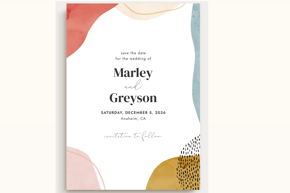
An abstract sage-and-blue watercolor wash frames a clean white text panel. It suits a modern couple who wants painterly color without literal florals, and it reads equally well for an indoor reception or an outdoor ceremony.

Ivory Garden
Soft peach watercolor blooms cluster in two corners over crisp white. Paired with serif and script type, it is a romantic match for a garden wedding or a daytime backyard celebration.

Lavender Blush
A moody lavender-and-charcoal watercolor wash gives this design an editorial feel. It suits a fall wedding, an evening reception, or any couple who wants a watercolor invitation with more depth than a pastel palette allows.

Elegant Flowers
Bold burgundy and blush watercolor peonies cascade down one side of the card. The dramatic jewel-tone pairing suits a formal fall wedding, particularly at an estate, ballroom, or vineyard venue.

Romantic Florals
Jewel-tone watercolor blooms in plum, teal, and blush frame the top and bottom of the card. It is a rich choice for a vineyard, estate, or fall wedding that wants a fuller floral presence than a corner accent.

Succulent Sunset
Purple and turquoise watercolor succulents and anemones bring a desert-modern palette to this design. It suits a Southwest wedding, a spring celebration, or any couple who wants a watercolor look that skips traditional roses and peonies.

Alpine Wreath
A hand-painted watercolor wreath of pine and eucalyptus frames the top and bottom of the card. It is a natural pick for a mountain wedding, a forest venue, or a winter celebration that wants greenery over florals.

Sakura
Watercolor cherry blossom branches drift across the corners of this card in soft pink. It is a graceful choice for a spring garden wedding, particularly one with an Asian-inspired or minimalist aesthetic.
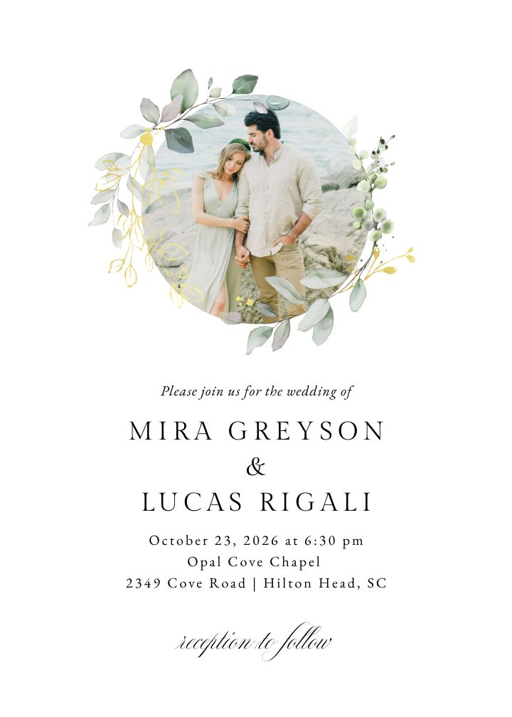
Bohemian Eucalyptus Photo Foil
Eucalyptus sprigs in a soft painted style with foil detailing and a photo option. A strong pick for couples who want watercolor greenery with a more premium finish.
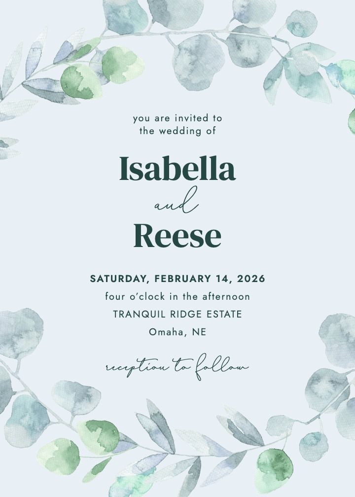
Eucalyptus Wreath
A painted eucalyptus wreath circles the names and date. Botanical and soft, it fits garden and outdoor weddings especially well.
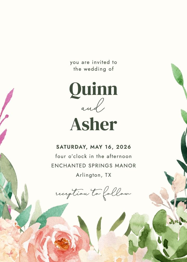
Vibrant Garden
Saturated watercolor blooms in a full garden arrangement. The boldest floral option in this set, for couples who want the flowers to carry the whole card.
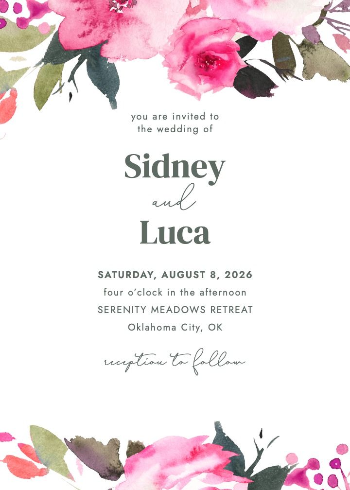
Fuchsia Forever
Bright fuchsia florals in a loose watercolor hand. Cheerful and vivid, it works well for a summer celebration with a strong color story.
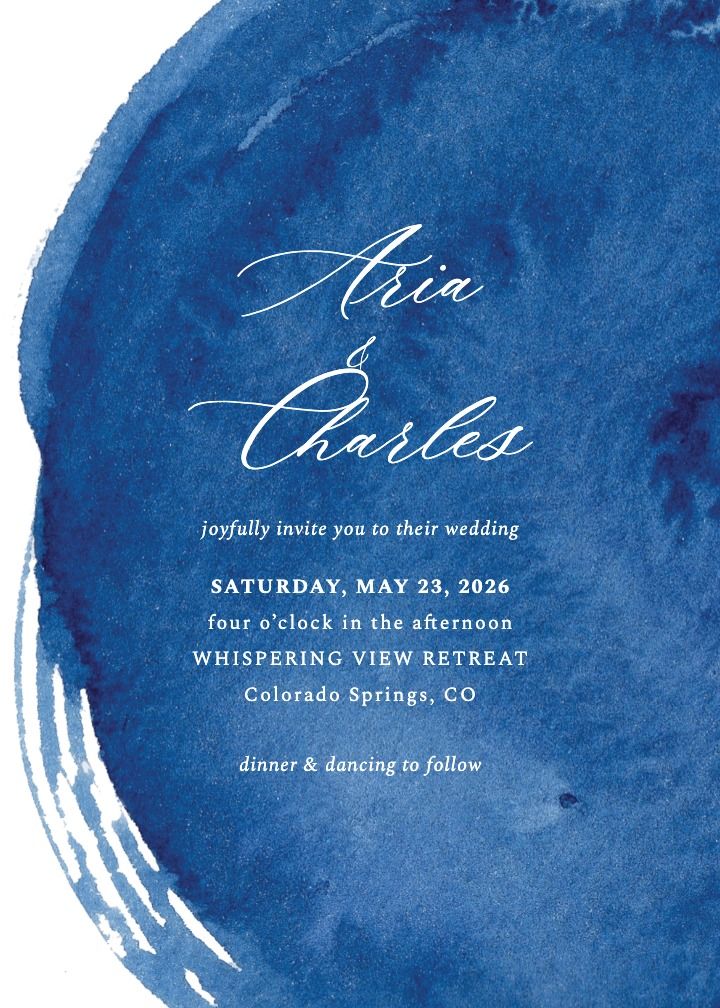
Porcelain Breeze
A pale blue wash with an airy, porcelain-like finish. Quiet and elegant, it suits coastal, spring, and minimalist weddings.
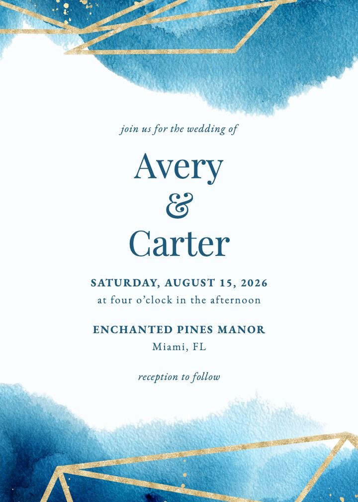
Geometric Watercolor
Angular geometric framing over a soft watercolor wash. A good middle ground for couples split between a modern and a painterly look.
How to Choose a Watercolor Color Palette
Because a watercolor wash carries so much visual weight, the palette does more work than it would on a flat-printed invitation. A useful way to narrow it down is to start with the mood of the wedding, then match a palette family to it. Most couples land on one of three broad directions: a light, pastel wash for a daytime or spring wedding; a richer jewel-tone palette for a formal or fall celebration; or a single-color monochrome wash for a more minimalist, modern look.
Pastel washes: blush, sage, lilac
Pastel watercolor palettes suit daytime garden weddings, spring ceremonies, and any couple who wants their invitation to feel light and airy. Blush and sage are a classic pairing, with lilac and dusty blue close behind. These palettes photograph well against white linen and pale wood, so they tend to coordinate easily with the rest of a soft, romantic tablescape.
If you are unsure where to start, pastel is the safest entry point into watercolor stationery. It reads as elegant without tipping into overly formal, and it pairs naturally with the greenery, dried flowers, and neutral linens that already dominate garden and backyard wedding decor.
Jewel-tone and moody blooms, like Joy’s Elegant Flowers and Romantic Florals
Burgundy, plum, teal, and deep terracotta washes give a watercolor invitation more visual weight and a formal, autumnal feel. This palette family pairs naturally with a fall wedding, an evening reception, or a vineyard or estate venue where richer colors already dominate the decor.
Monochrome and neutral washes
A single-color wash, painted in varying intensities of one hue such as navy, charcoal, or terracotta, is a quieter option that still reads as watercolor. It suits couples who want the painterly texture without a busy floral illustration, and it tends to work well for modern or minimalist wedding styles.
What a Watercolor Invitation Suite Typically Includes
A complete invitation suite is rarely a single card. Most couples order a core set and then decide whether to add optional matching pieces, and it helps to plan the full suite before ordering rather than adding pieces one at a time, since matching them later can mean a second production run.
Core pieces:
- The invitation card itself, with the watercolor artwork and main wedding details.
- An RSVP card, either a mail-back card or a card directing guests to an online RSVP.
- A details card covering accommodations, transportation, or a wedding website address.
Optional matching pieces:
- An envelope liner that repeats the watercolor wash or a coordinating color.
- A wax seal in a shade pulled from the palette.
- A matching save the date sent earlier in the planning timeline, so guests see the same artwork twice before the wedding.
Not every couple needs every piece. A smaller or more casual wedding might skip the details card and point guests to a wedding website instead, while a larger formal wedding often benefits from the full set so guests have every logistical detail in hand well before the day.
Custom Hand-Painted vs. Digitized Watercolor Designs
Watercolor invitations generally fall into two production categories, and the difference affects both cost and timeline.
| Approach | What it means | Typical cost range | Typical timeline |
|---|---|---|---|
| Digitized, pre-painted design | A stationer paints the artwork once, then digitizes it so any couple can customize wording and minor color choices. | Generally the more affordable option, often in the low tens of dollars per invitation | Fast: proof and print turnaround is usually measured in days, not weeks |
| Fully custom hand-painted illustration | An illustrator paints original artwork of your venue, monogram, or florals specifically for your wedding. | Priced per project or per guest, and substantially higher than a digitized design | Commonly four to six weeks for the artwork alone, before printing |
A digitized design makes sense for most couples who want the watercolor look without a long lead time or a large stationery budget. A fully custom illustration, especially a hand-painted rendering of your ceremony venue, is worth the extra time and cost for couples who want a completely one-of-a-kind keepsake. If you order a custom illustration, build the four-to-six-week art timeline into your planning calendar before you also account for printing and mailing. If the stationery budget is the deciding factor, it is worth comparing a digitized watercolor suite against other budget-friendly invitation ideas that still look custom-designed.
Matching Your Watercolor Invitation to Your Venue
A watercolor design does not need to depict your venue literally to feel connected to it. Matching the palette and motif to the setting, rather than trying to illustrate the exact location, is usually enough to make an invitation feel intentional.
Garden and outdoor ceremonies
Botanical wreaths, floral corners, and pastel washes suit a garden ceremony best, since they echo the greenery and blooms already present at the venue. White Garden and Ivory Garden both work well here.
Beach and coastal settings
Lighter washes in blue, sage, or sand tones keep a coastal invitation from feeling too floral-heavy. An abstract wash like Dream Wash reads as coastal-appropriate without leaning on shells or anchors as a theme.
Mountain, forest, and destination venues
Greenery-forward designs, like a pine and eucalyptus wreath, pair naturally with a mountain or forest wedding. These palettes also tend to photograph well against wood and stone, which is common at rustic or destination venues.
Ballroom and formal venues
Jewel-tone florals and monochrome washes carry more visual weight, which suits a formal ballroom or estate wedding. Elegant Flowers and Romantic Florals both lean into this richer palette family.
Watercolor Wedding Invitation Wording Basics
A watercolor design is a visual treatment layered over standard invitation wording, not a reason to change the wording itself. The conventional structure still applies: host line, the couple’s names, a request-to-attend line, date and time, location, a reception line if needed, and RSVP instructions. None of that changes based on how painterly the background is; the wording etiquette that applies to a foil-stamped invitation applies equally here.
Because a watercolor wash already brings texture and color to the card, keep the type simple and legible. A single serif or script font, set with generous spacing, lets the artwork carry the mood while the wording stays easy to read at a glance. For a full breakdown of formal versus casual phrasing, see this guide to wedding invitation wording and etiquette.
When to Order and Send Watercolor Wedding Invitations
Ordering timeline matters more for watercolor invitations than for simpler printed designs, mainly because custom artwork takes longer to produce than a template swap. Build in the four-to-six-week custom art window first, then add time for proofing and printing before you even reach the mailing stage.
Once invitations are printed, the standard mailing window still applies: about six to eight weeks before the wedding for a domestic celebration, and eight to twelve weeks out for a destination wedding, so guests have enough time to arrange travel. If your watercolor design is a digitized template rather than an original commission, you can compress this timeline considerably, since there is no illustration phase to wait on before the proofing stage begins.
It is also worth asking your stationer or platform how many rounds of proofing are included before you approve a final print run, since a hand-painted or custom-colored watercolor piece sometimes needs an extra round to get the wash exactly right.
Building a Coordinated Watercolor Wedding Suite
Many couples now treat the watercolor artwork as a thread that runs through the whole planning process rather than a one-time print job. The same wreath or floral wash that appears on the invitation can carry over to a save the date sent earlier, and again to a wedding website so guests see a consistent look from the first announcement through the RSVP.
If you are building that kind of coordinated suite, it is worth setting up a free wedding website early, so the same color palette and imagery show up the moment guests start looking for details, and so RSVPs and guest list updates flow into one place instead of a stack of mailed cards. Before your invitations go out, it also helps to finish collecting guest addresses in one place, so nothing gets mailed late because an address was missing. Pairing a physical invitation with an online RSVP option also makes it easier to handle wording and logistics questions guests might have, and customizing your RSVP questions ahead of time means the details card can point guests straight to a page that already has what they need.
For more inspiration before you commit to a final look, browse floral wedding invitation styles or themed invitation inspiration to see how a watercolor treatment compares with other popular directions for 2026.
Explore More Watercolor Wedding Invitations
The designs above are a starting set, not the whole shelf. Browse the full watercolor invitation collection to compare every available design side by side, filter by color, and open any of them in the editor to try your own names and wording.
Frequently Asked Questions
What are watercolor wedding invitations?
Watercolor wedding invitations use soft, painted color washes, florals, or landscape scenes instead of flat vector graphics or foil lettering. The artwork can be hand-painted and reproduced, or digitized from a pre-painted design that is customized with your wording.
How much do watercolor wedding invitations cost?
Digitized, pre-designed watercolor suites are generally the more affordable route, often priced in the low tens of dollars per invitation on stationery platforms. Fully custom hand-painted illustration work, especially a rendering of your specific venue, is priced substantially higher and is usually quoted per project or per guest.
Can watercolor wedding invitations be sent digitally?
Yes. Many watercolor designs are available as digital invitations in addition to printed cards, which works well for save the dates, destination weddings with a shorter planning window, or couples who want to pair a printed keepsake with a faster digital send to some guests.
How far in advance should I order watercolor wedding invitations?
If you are commissioning fully custom artwork, plan for roughly four to six weeks of illustration time before printing even begins. Digitized designs move much faster since the artwork already exists. Either way, aim to have invitations printed and ready to mail six to eight weeks before a domestic wedding, or eight to twelve weeks before a destination wedding.
What colors work best for a watercolor invitation suite?
Pastel washes in blush, sage, and lilac suit daytime garden weddings. Jewel-tone palettes in burgundy, plum, and teal suit fall or evening weddings. Monochrome washes in a single color, such as navy or terracotta, suit modern or minimalist styles.
Do watercolor invitations suit a formal wedding?
Yes, as long as the palette matches the formality. A pastel wash reads more casual, while a jewel-tone floral cascade or a deep monochrome wash reads as formal enough for a ballroom, estate, or evening black-tie wedding.
Once you have a watercolor design in mind, it helps to see the artwork alongside your actual wedding details before you commit to printing. You can browse invitation designs to compare palettes side by side, or set up a free wedding website so guests have a coordinated place to find directions, lodging, and your RSVP as soon as invitations go out.
