

Last Updated on September 29, 2026 by Joy Editors
Vintage wedding invitations are less a single style and more a family of them. One couple means 1920s Gatsby glamour, another means Edwardian garden romance, and a third means weathered wood and kraft paper. What they share is a deliberate nod to the past, expressed through typography, motifs, color, and paper texture rather than novelty.
This guide walks through the major vintage eras, explains what makes each one feel authentic, and showcases real invitation designs you can order as printed cards, send digitally, or both. By the end, you will know which era fits your wedding and how to carry the look from the envelope all the way to your RSVP page.
Vintage wedding invitations borrow their typography, motifs, and color palettes from a specific era, most often Victorian or Edwardian romance, 1920s Art Deco, or mid-century retro. The strongest designs commit to one era’s visual language instead of mixing them. Vintage invitations are available as printed cards, digital sends, or both, so the period look can carry from envelope to wedding website.
What Makes a Wedding Invitation Feel Vintage
A vintage invitation feels authentic when it commits to one era’s typography, motif, and palette. Mixing Victorian ornament with Art Deco geometry reads as costume rather than period style. The single best decision you can make is choosing your era first and letting every other choice, from typeface to envelope liner, follow from it.
Three era families dominate vintage wedding invitation design: Victorian and Edwardian romance, Art Deco and the Roaring Twenties, and mid-century retro. Each calls for a different level of wording formality, a different palette, and a different mood at the mailbox. Rustic and botanical vintage sit alongside these as motif-driven styles that borrow aged textures and antique illustration rather than a specific decade.
Once you know your era, the next decision is format. Vintage styling works on paper, on screen, and across both at once. You can browse wedding invitations by style and filter for the look you want, then decide how each guest receives it.
| Approach | Best for | Keep in mind |
|---|---|---|
| Print and digital in one design | Couples who want the era look on paper for some guests and instant delivery for others, with RSVPs collected online either way | Order printed cards for close family and the wedding party, send the same artwork digitally to everyone else |
| Printed suite only | Formal weddings where a physical invitation in hand is part of the experience | Budget for save the dates, invitations, and day-of pieces separately, and allow printing and mailing time |
| Digital only | Short timelines, destination weddings, and budget-conscious plans | Some older guests may still appreciate a printed card, so consider a small paper run alongside the digital send |
Vintage Invitation Styles by Era
Every vintage style is really a set of visual rules. Learn the rules for your era and the design decisions stop feeling like guesswork. Here is how the five major families differ.
Victorian and Edwardian Romance
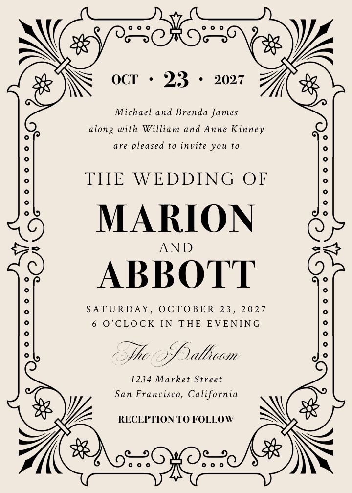
Marion
Fine-lined ornament and a soft cornflower palette give this design its Edwardian tea-party character. Choose it when the venue leans garden-estate and the mood should feel collected rather than grand.
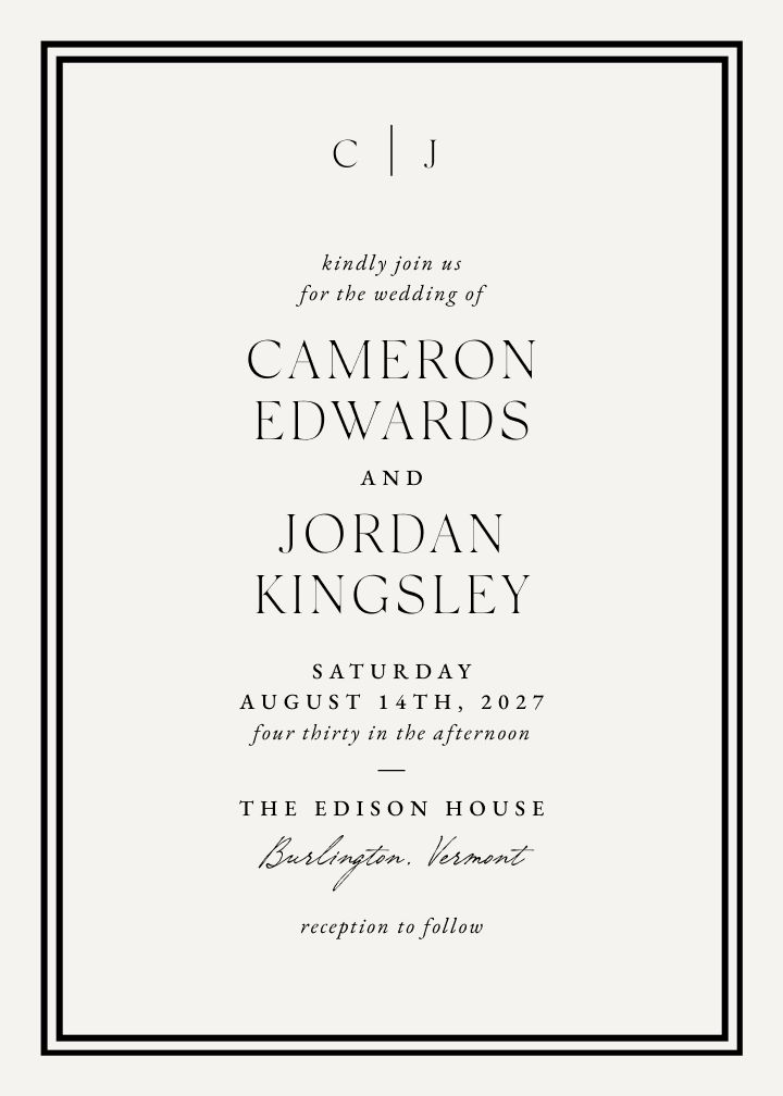
Vintage Porcelain
Crisp bordered framing in a warm mocha tone, the look of fine porcelain transferred to paper. A quiet, formal choice that flatters traditional wording and classic venues.
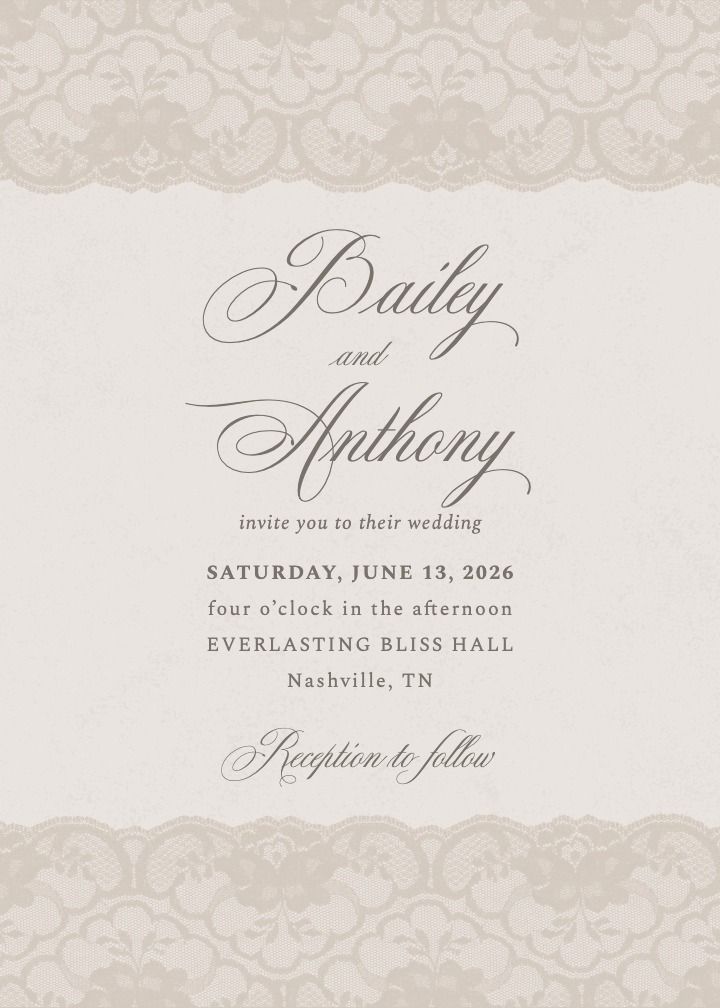
Chantilly Beige
Soft beige tones with delicate detailing, the gentlest read in the vintage set. Works for daytime ceremonies and couples who want vintage warmth without heavy contrast.
Art Deco and the Roaring Twenties
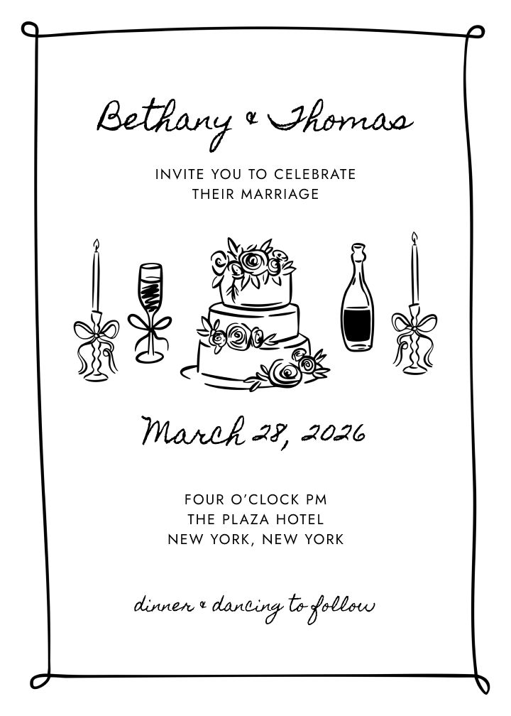
Bonsoir
French-inflected evening glamour in black. The name says it: this is for couples channeling a 1920s soiree, champagne towers, and late-night dancing.
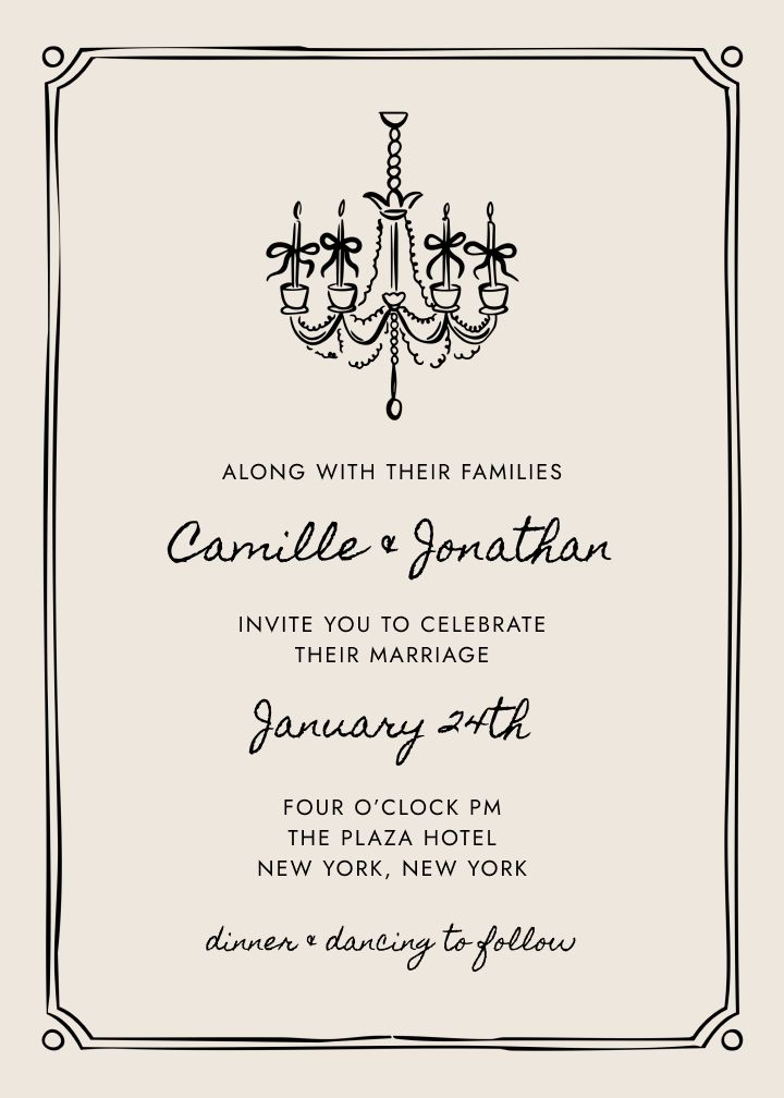
La Luce
Light as the motif: luminous detailing against a dark ground. A strong pick for New Year or evening weddings where the stationery should feel like a night out.
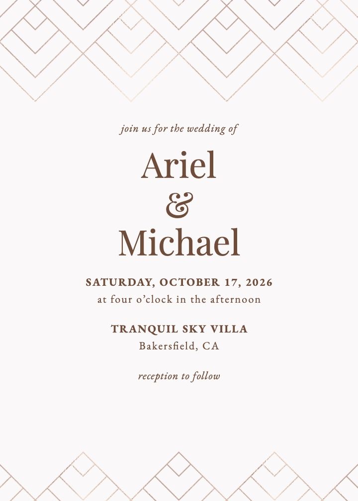
Deco Moderne
Clean geometric structure with the symmetry and stepped lines the era is known for. The restrained way to do Gatsby: architectural rather than costume.
Mid-Century and Retro
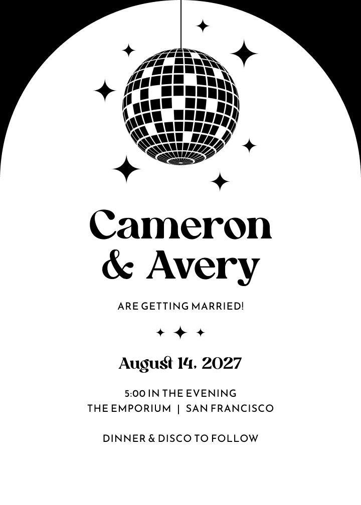
Mirrorball
A disco-ball motif in a playful neon colorway. For couples whose vintage skews 1970s dance floor: fun, confident, and a little irreverent.
Rustic and Country Vintage
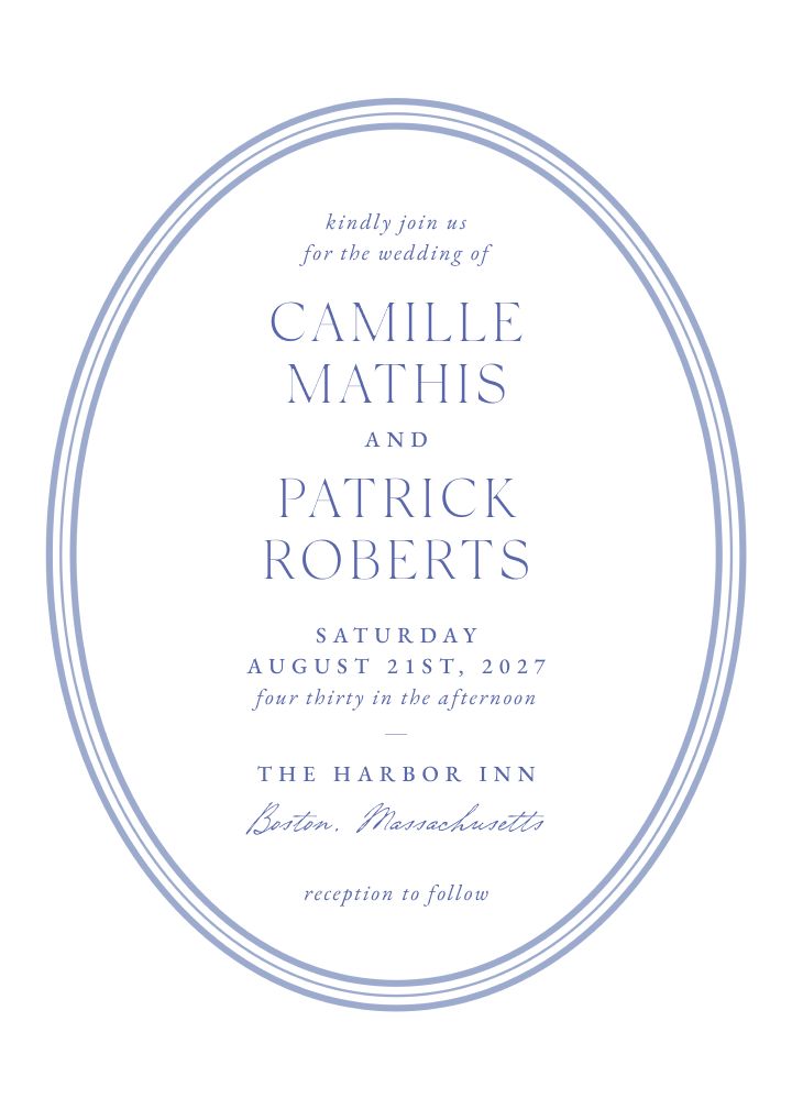
Parkside
A mossy, park-bench green with weathered texture, the vintage of country estates and orchard venues. Pairs naturally with kraft details and hand-tied florals.
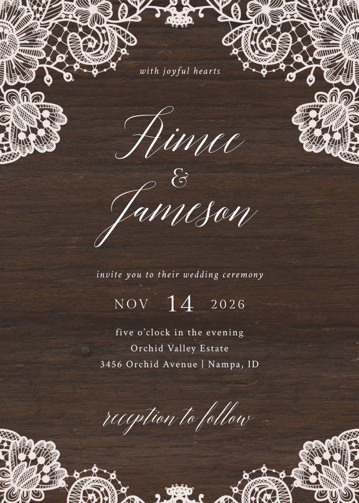
Antique Woodgrain
A weathered wood texture that reads farmhouse-attic rather than formal. The rustic anchor of the set, made for barns, farms, and outdoor ceremonies.
Botanical and Garden Vintage
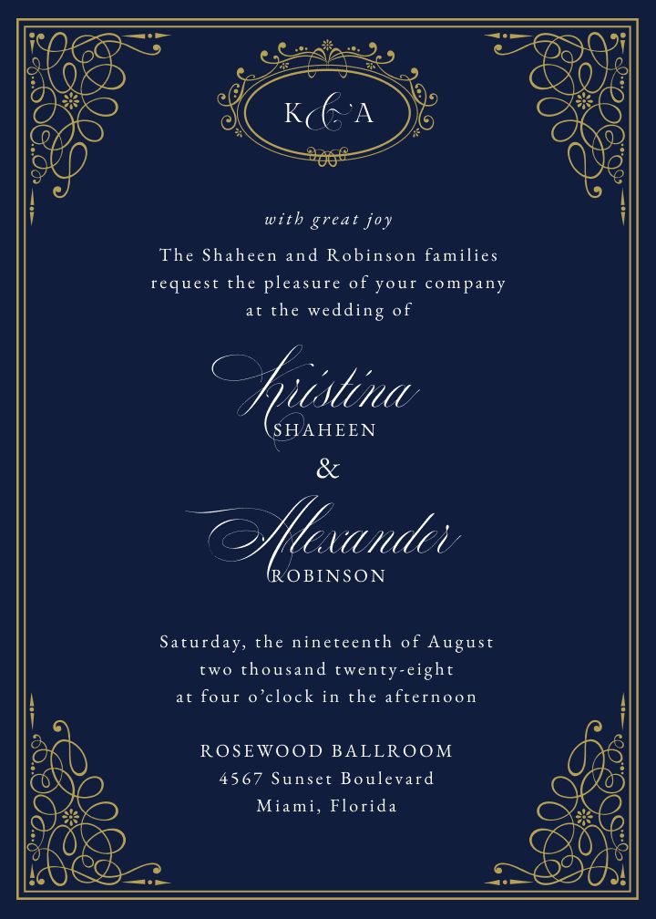
Queens Palace
Dark blue with regal gold detailing: the most formal garden-party design here. Victorian botanicals meet ballroom formality.
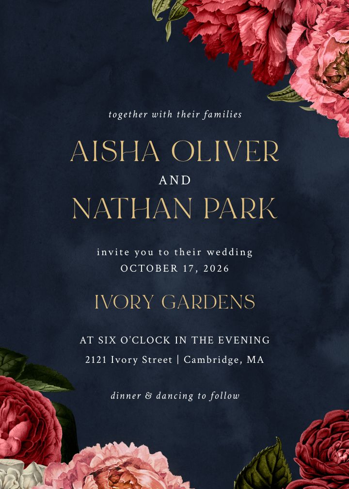
Classical Peonies
Dark, dramatic botanical florals that channel Victorian naturalist plates. For moody romantic weddings: candlelight, deep-toned bouquets, and rich fabrics.
Wording and Details That Sell the Era
Match the wording to the era. Victorian and Edwardian designs suit traditional third-person wording with full names, Art Deco invitations can carry a sharper and more direct tone, and mid-century and retro designs work with warm, celebratory phrasing. A highly ornate design paired with casual wording creates a disconnect guests can feel, even if they cannot name it.
Two short examples make the difference concrete. For a Victorian or formal design:
Mr. and Mrs. Thomas Ellery request the honour of your presence at the marriage of their daughter, Catherine Anne, to Mr. James Whitmore, on Saturday, the tenth of October, at half past five in the evening.
For an Art Deco or retro design, a sharper register works:
Catherine Ellery and James Whitmore invite you to celebrate their wedding. Saturday, October 10, five thirty in the evening. Dinner and dancing to follow.
For more templates across every level of formality, see this guide to wedding invitation wording. And if you are starting earlier in the timeline, the same era rules apply to your save the dates, which set expectations for everything that follows.
Palette recap, by era:
- Victorian: jewel tones, ivory, aged gold, dramatic dark florals.
- Edwardian: rose, sage, lavender, pale gold, soft botanical detail.
- Art Deco: black and gold, white and gold, deep teal, cool silver.
- Mid-century and retro: dusty rose, olive, terracotta, mustard, cream.
- Rustic vintage: warm browns, cream, sage, muted burgundy.
Finishes matter as much as palette. Metallic foil detailing sells gilded eras like Victorian and Deco. Textured and aged-looking stocks sell rustic and botanical vintage. Whatever you choose, limit yourself to one or two era signatures per card, because restraint is what separates period style from costume.
Carry the Vintage Look From Envelope to RSVP
Most vintage invitation advice ends at the mailbox. In practice, your guests interact with your wedding stationery across months: a save the date, an invitation, a website visit, an RSVP, and day-of details. When each touchpoint shares the same design, the theme reads as intentional. When they clash, even a beautiful invitation loses its effect.
A vintage invitation design can now run through the entire communication flow: printed save the dates, a digital invitation in the same artwork, and a wedding website and RSVP page that match. That means the Gatsby geometry or the Victorian florals your guests first see in the envelope greet them again when they open the link to respond.
This also solves a practical problem. Many couples want printed invitations for parents, grandparents, and the wedding party, but prefer instant delivery and online RSVPs for everyone else. Sending the same design on paper to some guests and digitally to others keeps the look unified while respecting budget and timeline. You can build a matching wedding website in the same design so RSVP responses, travel details, and registry information all live inside the vintage frame you chose.
To keep the theme from tipping into costume, pick one era and one or two of its signature elements, such as a Deco typeface or an Edwardian botanical border, then let the rest of the design breathe in a clean contemporary layout. Carry the same palette into your website and day-of stationery, and the theme will read as a point of view rather than a theater production.
Frequently Asked Questions
What is the difference between vintage, antique, and classic wedding invitations?
Vintage designs reference a specific historical era, such as Victorian, Art Deco, or mid-century. Antique describes an aged look: worn textures, faded color, aged-paper effects. Classic means timeless formal styling that is not tied to one period. The labels overlap in practice, so shop by the visual era you want rather than the category name.
How formal should the wording be on vintage wedding invitations?
Match the wording to the era. Victorian and Edwardian designs suit traditional third-person wording with full names. Art Deco invitations can carry a sharper, more direct tone. Mid-century and retro designs work with warm, celebratory wording. A highly ornate design paired with casual wording creates a disconnect guests can feel.
What colors work best for vintage wedding invitations?
It depends on the era. Victorian leans on jewel tones, ivory, and aged gold. Edwardian palettes run softer: rose, sage, lavender, pale gold. Art Deco is high contrast: black and gold, white and gold, deep teal. Mid-century favors muted tones like dusty rose, sage, and terracotta.
Can I send vintage-style wedding invitations digitally?
Yes. Many vintage invitation designs are available as digital invitations as well as printed cards, so you can email or message the same artwork to some or all of your guests and collect RSVPs online. This is also a practical way to keep a period look while staying on budget or on a short timeline.
How do I keep a vintage theme from looking like a costume?
Pick one era and one or two of its signature elements, such as a Deco typeface or an Edwardian botanical border, then let the rest of the design breathe in a clean, contemporary layout. Carry the same palette into your wedding website and day-of stationery so the theme reads as intentional rather than theatrical.
Find Your Era
The right vintage invitation is the one that commits: one era, one palette, one mood, carried consistently from the first envelope to the final RSVP. Start with the era that matches your venue and your voices as a couple, then explore the full collection of wedding invitations to find the design that brings it to life on paper and on screen.
