

Last Updated on September 29, 2026 by Joy Editors
An elegant save the date does quiet, confident work. Long before the invitation arrives, it tells guests what kind of celebration they are being welcomed into: the formality, the palette, the mood. For couples planning a classic, formal, or black tie wedding, the save the date is the first proof that every detail has been considered.
This guide defines what actually makes a save the date read as elegant, walks through twelve designs across classic, minimal, Art Deco, and dramatic sub-styles, and covers the practical questions of timing, wording, and coordination. Every design featured here is available as a printed card, a digital card, or both, with a matching wedding website and RSVP tracking built in.
Elegant save the dates share a few traits: refined typography, a restrained color palette, generous whitespace, and one elevated accent such as a metallic detail or formal monogram. The style spans classic crests, Art Deco geometrics, marble textures, and romantic florals. With Joy, couples can send an elegant design on paper or digitally, matched to a free wedding website with built-in RSVP tracking.
What Makes a Save the Date Elegant
Elegance in stationery is a discipline, not a price point. The most refined save the dates are rarely the busiest ones. They are composed: every element earns its place, and nothing competes for attention. When a card feels elegant, it is usually because the designer practiced restraint in four specific places.
- Typography. One or two typefaces, chosen with care. A graceful serif or a well-spaced script carries formality on its own. Mixing three or four fonts almost always reads as cluttered rather than luxurious.
- Palette restraint. Elegant designs typically work in two or three tones: cream and gold, navy and white, black and ivory. A limited palette signals confidence. Loud, crowded color schemes signal the opposite.
- Whitespace. Empty space is what lets names and dates breathe. A card with generous margins and breathing room around the text feels formal before a single word is read.
- One elevated accent. A single flourish, such as a gilded crest, a structured border, or a formal monogram, gives the eye a place to rest. Two or three competing accents turn elegance into ornament.
Premium print techniques like foil pressing and letterpress are one route to this feeling, and they can be beautiful. But restraint does the same work at any budget. A clean layout, a quiet palette, and confident typography will always read as more elegant than an expensive finish applied to a busy design. This is encouraging news for couples who love the look of formal stationery but are watching costs: elegance is available at every price point when the composition is disciplined.
It is also worth remembering that elegance is contextual. A design that reads as refined at a candlelit ballroom reception can feel stiff at a barefoot garden ceremony. The most elegant choice is the one that matches the celebration it announces, which is why the sub-style matters as much as the style label.
12 Elegant Save the Date Designs to Inspire You
The twelve designs below span the full range of what elegant can mean, from regal crests to editorial black and white. Each is named, pictured, and linked so you can explore the details, personalize the wording, and see how the design carries across paper and digital formats. The group was chosen for variety: different palettes, different motifs, and different typographic voices, so at least one direction should feel like yours.
Classic and Regal
Traditional elegance leans on heraldic structure, formal monograms, and old-world pattern. These four designs suit ballroom venues, estate gardens, and any celebration where the dress code starts at formal.

Classical Crest
A gilded monogram crest gives this design the feel of a formal family announcement. It suits couples who want tradition front and center, with heraldic detail doing the decorative work so the wording can stay spare. Pair it with a black tie dress code and a classic serif invitation suite.

Maison
Regal blue florals frame the details here with a vintage estate-garden character. It is a natural fit for chateau, manor, and garden venues where the setting itself carries old-world romance. The blue palette also coordinates easily with classic navy or dusty blue wedding colors.

Vintage Porcelain
Blue and white porcelain patterning gives this design a chinoiserie-inspired refinement that feels collected rather than trendy. It works beautifully for couples drawn to heirloom details and tableware-inspired palettes. The pattern is distinctive enough to anchor the whole paper suite.

Regency
Soft cream and blush tones channel the romance of period drama without tipping into costume. This design flatters spring and summer weddings with a formal but gentle mood. It pairs well with calligraphy-style addressing and a wax-seal sensibility.
Modern and Minimal
Minimal elegance proves the restraint principle directly. These designs remove almost everything, and what remains feels expensive because there is nothing to hide behind. They suit couples who would rather whisper than announce.

Classic Marble
Black and white marble veining brings architectural weight to a modern black tie announcement. The texture reads as stone rather than pattern, which keeps it grounded and formal. It is a strong choice for museum, loft, and city venues.

Elegant Paper
Cream texture and near-empty composition make this the purest expression of restraint in the group. The design asks the paper and the typography to do all the work, and they do. Choose it when the celebration itself is understated and you want the stationery to match.

Felicity
Bold black and white typography gives Felicity a fashion-editorial edge. It is elegant through confidence rather than ornament, and it suits couples whose taste runs toward galleries, tailoring, and design magazines. The high contrast also photographs beautifully when guests share it.
Art Deco Glamour
Deco elegance comes from geometry: fan shapes, sunbursts, and disciplined symmetry. These two designs capture Gatsby-era glamour with very different palettes, one deep and saturated, one cool and architectural.

Emerald City
Deep green and gold geometry makes this design feel like an invitation to a 1920s ballroom. The saturated emerald ground is dramatic without being loud, since the Deco linework keeps everything structured. It is ideal for winter weddings and historic venues.

Formal Deco
Structured blue and gold lines deliver vintage glamour with a lighter touch than most Deco designs. The geometry frames the wording instead of crowding it, so the card stays readable and composed. It works well for couples who want a Deco nod without full theatrical commitment.
Dark and Dramatic
Dark grounds read as formal in the way evening wear does. These two designs use black and deep tones to make florals feel moody rather than sweet, and both reward couples planning an after-dark celebration.

Chrysanthemum
Botanical blooms against a dark ground give this design the mood of a formal evening garden. It suits fall and winter celebrations, candlelit venues, and couples who want florals without pastel softness. The contrast keeps the composition sharp and gallery-worthy.

Rosebed
Roses on a dark ground trade sweetness for drama, which makes the romance feel grown-up and intentional. This design is a natural match for evening ceremonies and venues with low, warm lighting. Keep the rest of the suite equally restrained so the florals stay the focal point.
A Formal Photo Finish
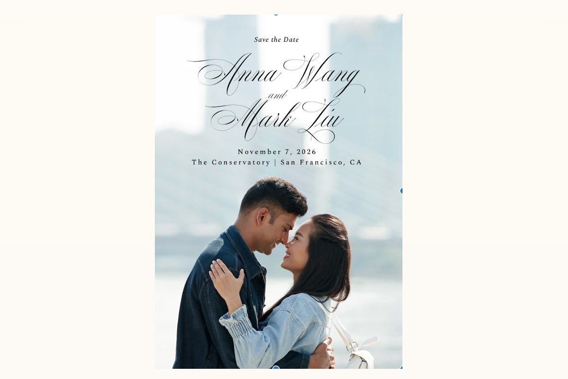
A photo save the date can still be elegant when the typography is treated as seriously as the portrait. One design in this collection proves the point.

Symphony
A formal portrait framed by refined typography keeps this photo card in black tie territory. Choose a composed, editorial-style engagement photo rather than a casual snapshot, and the result reads like an announcement page. It is the right pick for couples who want their faces on the card without giving up formality.
Paper, Digital, or Both
Couples planning elegant weddings increasingly split the difference: printed cards for the formal mailing, digital cards for late additions, overseas guests, and updates. Every design in this guide works in both formats with the same artwork, so there is no visual compromise either way. Digital delivery also adds delivery tracking, which tells you exactly who has seen the announcement, and instant updates if a date or venue detail changes.
The hybrid approach solves a real etiquette problem. A colleague group finalized after the print run, a relative’s new partner, a friend whose address changed: each of these used to mean an awkward late card in a visibly different style, or an expensive reprint. Sending the identical design digitally keeps every guest’s first impression consistent, no matter when they joined the list.
The table below compares the three routes couples typically weigh when shopping for elegant stationery.
| Option | Printed Cards | Matching Digital | Matching Wedding Website | Online RSVP Tracking | Typical Price Position |
|---|---|---|---|---|---|
| Joy | Yes, every design | Yes, same artwork | Yes, free and matching | Built in, tied to the guest list | Accessible |
| Boutique stationery studio | Yes, often with premium finishes | Rarely | No | No | Premium boutique |
| Print-on-demand marketplace | Yes | Sometimes, as a separate product | No | No | Varies widely |
The practical advantage of the connected route shows up after mailing day. When the save the date, the wedding website, and the RSVP system share one design and one guest list, nothing has to be rebuilt or reconciled later. Responses, meal choices, and plus-one details collect against the same list the save the date went to, which removes the spreadsheet reconciliation that usually follows the invitation mailing.
When to Send Save the Dates
Timing is where elegant planning shows. Save the dates that arrive too late force guests to choose between your wedding and prior commitments, which is the opposite of the gracious tone the card is meant to set.
- Standard timeline: six to eight months before the wedding date.
- Destination weddings: eight to twelve months ahead, so guests can budget and book travel.
- Holiday weekends and peak season dates: lean toward the early end, since guests are competing for flights and hotel blocks.
- Before you mail: finalize the guest list first. Save the dates go only to people who will also receive an invitation, so a list still in flux is a reason to wait a few weeks, not to send early.
Formal weddings deserve the earlier end of every range. Black tie celebrations tend to draw guests from farther afield, and travel for a formal event costs more in both money and planning. Giving those guests an extra month or two of notice is itself an elegant gesture.
If a few guests are added late, a digital card in the same design closes the gap without a second print run or an obviously different announcement. The timing rule that matters most is simple: no guest should learn the date later than they need it to attend comfortably.
What to Include on Your Save the Date
Save the dates carry less information than invitations, and elegant ones carry less still. The card needs four things: the couple’s names, the wedding date, the city and state of the celebration, and a line noting that a formal invitation will follow. A wedding website URL is a worthwhile fifth element, since it gives eager guests somewhere to go for travel details.
Formality on the card comes from phrasing as much as design. Spelling out the date in words, using full names, and keeping the wording to a few short lines all signal a formal event before the invitation confirms it. A formal wording variant:
Together with their families
Eleanor Rose Whitfield and James Alexander Cole
request the honor of your presence at their wedding
Saturday, the tenth of October, two thousand twenty-six
Charleston, South Carolina
Formal invitation to follow
What to leave off: the exact venue, the ceremony time, registry information, and RSVP requests. Those belong on the invitation and the wedding website. A save the date is not an RSVP vehicle; asking for responses this early produces unreliable counts and extra chasing, since guests cannot reliably commit to plans eight months out.
On the question of whether you need both a save the date and an invitation: for most weddings, yes. The save the date secures the date on guests’ calendars months out. The invitation, sent closer to the wedding, carries the full logistics and collects the actual response. They do different jobs, and skipping the first one makes the second one harder. Very small weddings with a short engagement are the usual exception, where one well-timed invitation can do both jobs.
Matching Invitations and Wedding Website
The most elegant paper suites are the coordinated ones. When the save the date, the invitation, and the day-of pieces share a design family, the whole celebration feels intentionally composed rather than assembled. Once you have shortlisted a save the date above, look for wedding invitations in the same style so the second mailing continues the story the first one started.
Because this style family is color-led, with gold, cream, and black tie palettes doing much of the work, it is also worth coordinating the digital side. Matching wedding website designs in gold keep the palette consistent from the envelope to the page where guests RSVP. Guests who receive a gilded crest card and then land on a matching gold website experience one design decision instead of two unrelated ones.
Coordination pays off again on the wedding weekend. When menus, place cards, and signage echo the same typography and palette as the stationery guests have already seen twice, the whole event reads as a single considered vision. That continuity is the difference between a wedding that looks decorated and one that looks designed.
FAQ
What makes a save the date elegant?
Elegant save the dates rely on restraint: one or two typefaces, a limited palette, generous whitespace, and a single elevated detail such as a metallic accent, a formal monogram, or a structured border. Composition quality matters more than expensive print techniques.
When should you send elegant save the dates?
Plan to send save the dates six to eight months before the wedding, and eight to twelve months ahead for destination celebrations or holiday-weekend dates. Sending early gives guests time to arrange travel and time off, especially for formal events that draw from out of town.
What information should an elegant save the date include?
Include the couple’s names, the wedding date, and the city and state of the celebration, plus a line noting that a formal invitation will follow. A wedding website URL is a practical addition; keep wording spare, since formality comes from phrasing and typography rather than crowding the card.
Can a digital save the date still look elegant?
Yes. Elegance comes from the design itself, not the medium. A well-composed digital save the date with refined typography and a restrained palette reads just as formally as paper, and it adds delivery tracking and instant updates that a printed card cannot offer.
Explore More Elegant Save the Dates
The twelve designs above are a starting point, not the whole shelf. If none of them is quite right, or if you want to compare a few more directions before committing, browse elegant save the date designs across the full collection, or explore the broader save the date gallery to see how elegant sits alongside other styles. Every design can be personalized with your wording, sent on paper or digitally, and carried through to a matching wedding website, so the tone you set now holds all the way to the wedding day.
