

Last Updated on September 29, 2026 by Joy Editors
Your wedding invitation is the first preview guests receive of the day you are planning. Before anyone sees the venue, the flowers, or the dress, they see a card in an envelope, and that card quietly tells them what to expect. An elegant invitation signals a celebration that is polished, intentional, and worth dressing up for.
This guide breaks down what actually makes an invitation feel elegant, then walks through twelve designs across classic, metallic, Art Deco, dramatic, and romantic styles. Every design shown here is available as a printed card, a digital card, or both, so you can match the format to your plans and your budget. If you are ready to look around while you read, you can browse wedding invitation designs and save favorites as you go.
Quick answer: Elegant wedding invitations share a few traits: refined typography, generous whitespace, a restrained palette, and one elevated accent such as a metallic detail or watercolor motif. The style spans classic script suites, Art Deco geometrics, marble minimalism, and moody florals. With Joy, couples can send an elegant design on paper or digitally, matched to a free wedding website with built-in RSVP tracking.
What Makes a Wedding Invitation Elegant
Elegance in stationery is less about cost and more about restraint. The designs that read as refined, year after year, tend to share the same handful of decisions. When you are comparing options, look for these markers.
- Refined typography. One or two typefaces, usually a serif or a script paired with a clean secondary font. Too many fonts on one card is the fastest way to lose the elegant effect.
- A restrained palette. Two or three colors, often a neutral base with one accent. Ivory with gold, white with slate, or blush with rose gold all work because they do not compete for attention.
- Generous whitespace. Elegant cards let the design breathe. Text is not crammed to the edges, and empty space is treated as part of the composition.
- One elevated accent. A single special detail: a metallic motif, a watercolor wash, a structured border, or a textured pattern. One accent reads as intentional. Three accents read as busy.
- Consistent wording style. Formal phrasing, consistent capitalization, and clean alignment keep the card feeling composed from the first line to the RSVP note.
Color deserves its own note because it is where many couples hesitate. The palettes that most reliably read as elegant are the quiet ones: ivory and gold, white and charcoal, blush and rose gold, deep navy with silver, or a single dark ground with white type. If your wedding colors are bold, you do not have to abandon them; use the boldest shade once, as an accent, and let neutrals do the rest of the work.
The practical takeaway: you do not need letterpress plates or hand-applied foil to get the look. A well-composed printed card or a thoughtfully designed digital invitation can carry the same formality, because elegance lives in the design decisions, not in the production technique.
12 Elegant Wedding Invitation Designs to Inspire You
The designs below are grouped by style so you can move straight to the aesthetic that fits your celebration. Each one is available as a printed card, a digital card, or both, and each can be paired with a matching wedding website in the same artwork.
As you look through them, resist the urge to judge a design only on its artwork. Picture your names in the typeface, your venue’s formality in the palette, and your guests opening the envelope. The right design is the one where all three pictures agree.
Classic and Timeless
Classic designs lean on traditional composition: centered type, soft florals, neutral grounds, and nothing that will feel dated in photographs thirty years from now. If you are unsure where to start, this category is the safest foundation, because it flatters nearly every venue and dress code.

Elegant Flowers
Watercolor blooms in soft reds and pinks give this design a garden-formal character that suits spring and summer ceremonies. The florals frame the text rather than crowd it, so the card keeps its composure. It works especially well for venues like botanical gardens, estates, and conservatories.

Elegant Paper
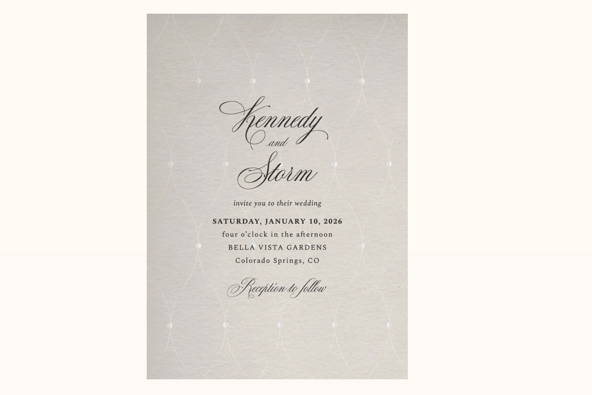
This cream textured design is proof that restraint reads as luxury. There is almost no ornament here, just clean type on a warm neutral ground, which makes it a strong choice for couples who want formality without decoration. It pairs naturally with simple white or ivory envelope liners.

Classic Marble
A black and white marble texture gives this design a modern black tie quality. The high contrast makes the typography feel architectural, and the neutral palette matches nearly any wedding color scheme. Consider it if your venue leans modern: a gallery, a loft, or a hotel ballroom.
Metallic and Modern
A metallic accent is the classic shortcut to formality. These designs use gold and rose gold details against clean grounds, so the shine stays an accent instead of taking over the card.

Gold Confetti
Scattered gold accents on white strike a balance between celebratory and formal. The confetti motif reads as joyful rather than loud, which makes it a good fit for evening receptions and New Year or holiday season weddings. Keep the rest of your suite simple so the gold stays the focal point.

Interlocked Rose
Rose gold geometric rings give this design a modern minimal statement with a quiet nod to the wedding bands themselves. The motif is structured but soft, which suits couples who want something contemporary that still feels romantic. It photographs beautifully in flat lay stationery shots.
Art Deco Glamour
Art Deco designs bring structure and symmetry: sunbursts, fan shapes, and geometric borders borrowed from 1920s architecture. They are a natural match for ballroom venues, vintage themes, and Gatsby-inspired celebrations. Deco also photographs exceptionally well, since the geometry stays crisp in close-up stationery shots.

Deco Sunburst Silver
A silver sunburst radiating across a dark ground captures Gatsby-era glamour without a single floral. The silver-on-dark palette feels like an evening event all by itself. Pair it with a black tie dress code line on the card and the invitation does half the tone-setting for you.

Deco Moderne
This design takes the Deco vocabulary and strips it back to clean geometric lines. It is the right choice for couples who want vintage structure without heavy ornament, and its lighter palette works for daytime as well as evening. A metallic envelope liner can add back as much glamour as you want.
Dark and Dramatic
Dark invitations have moved firmly into the elegant mainstream. A deep ground makes metallic and white type feel luminous, and it sets expectations for a formal evening celebration the moment the envelope is opened.

Chrysanthemum
Dark botanical florals in black and purple tones give this design a moody, formal character suited to evening celebrations. The florals keep the darkness romantic rather than severe. It works particularly well for fall and winter weddings where candlelight is part of the plan.

Queens Palace
Regal blue and gold detailing gives this design a grand, almost ceremonial presence. The framing devices echo invitation traditions from formal state occasions, which is exactly the register a black tie ballroom wedding calls for. If your celebration has a royal or old-world theme, this is the card that carries it.
Soft and Romantic
Romantic elegance trades structure for softness: airy palettes, painterly florals, and type that feels handwritten without being casual. These designs suit daytime ceremonies, garden venues, and spring celebrations.

Chiffon
Airy white and pink softness makes this design feel like the fabric it is named after. Nothing on the card is heavy, which suits romantic daytime ceremonies and outdoor venues. It is a natural companion to a blush and ivory wedding palette.

Dramatic Peonies
Oversized watercolor peonies bring romantic drama to the card without losing refinement. The scale of the florals is the statement, so the typography stays quiet and lets the artwork lead. Choose this if your wedding flowers will be a centerpiece of the day and you want the invitation to foreshadow them.
A Note on Acrylic and Specialty Materials
Boutique studios often frame elegance as a production technique: letterpress impressions, laser cut overlays, vellum wraps, and printed acrylic sheets. These techniques are beautiful, and they also carry premium pricing and longer lead times. If you love the look, it is worth knowing that the visual effect can often be achieved through design rather than material.

Blue Acrylic Floral
This design interprets the acrylic-invitation look, with its translucent feel and floating florals, in an accessible format. You get the visual signature that boutique studios charge a premium for, without committing to specialty materials or extended production windows. It suits blue and white palettes and waterside venues especially well.
Paper, Digital, or Both
The old rule said formal weddings require paper. The newer reality is more flexible, and the strongest approach for many couples is a hybrid: printed invitations for the formal mailing, plus matching digital pieces for the situations paper handles poorly.
Think about the moments paper cannot cover well. A guest’s invitation gets lost in the mail. You add a handful of names to the list a month before the wedding. The venue changes a detail after your print run. A digital version of the same design handles all of these gracefully, with delivery tracking so you know it arrived. Because each design in this guide also powers a matching wedding website, guests see one consistent look from the envelope to the page where they RSVP through your wedding website.
Here is how the main stationery routes compare for a couple chasing an elegant look:
| Joy | Boutique stationery studio | Print-on-demand marketplace | |
|---|---|---|---|
| Paper option | Printed cards in every design shown here | Full custom suites, often with specialty techniques | Printed cards from independent designer templates |
| Matching digital version | Yes, same design as the printed card | Rarely offered | Sometimes, as a separate product |
| Matching wedding website | Yes, in the same artwork as the invitation | No | No |
| Online RSVP tracking | Built in, tied to your guest list | No, reply cards handled manually | Varies, often a separate tool |
| Typical price position | Accessible, with a free website included | Premium boutique, often several hundred dollars per suite | Mid-range, varying by designer |
The hybrid strategy plays to each format’s strength. Mail printed invitations to your full list for the formality of the moment. Then use the digital twin of the design for late additions, re-sends, and updates, and let online RSVP tracking collect responses, meal choices, and plus-one details directly against your guest list instead of a spreadsheet. If you want step-by-step detail on the response side, the feature page for online wedding RSVPs walks through how responses, meal choices, and plus-ones are collected in one place.
Elegant Invitation Wording: What to Include
Elegant wording is spare wording. The formality comes from phrasing and typography, not from crowding the card with information. A well-composed invitation typically carries five things:
- The couple’s names, given visual prominence.
- The date, spelled out for formal suites (“Saturday, the twentieth of June”).
- The ceremony start time.
- The venue name and city.
- A short line directing guests to RSVP details, usually your wedding website.
Everything else, including directions, hotel blocks, registry notes, and the schedule, belongs on the wedding website rather than the card. Keeping the card to the essentials is itself an elegant choice.
A formal wording example:
Together with their families
Amelia Rose Carter and James Alexander Bennett
request the honour of your presence at their marriage
Saturday, the twentieth of June, two thousand twenty-six
at half past four in the afternoon
The Whitmore Estate, Charleston, South Carolina
A modern wording example:
Amelia and James are getting married
Saturday, June 20, 2026, at 4:30 in the afternoon
The Whitmore Estate, Charleston, South Carolina
Please RSVP at our wedding website
Both versions carry the same information. The first leans on tradition; the second leans on simplicity. Either reads as elegant when the design around it is restrained.
Two small wording habits make an outsized difference. First, keep line breaks deliberate: each line should hold one complete thought, so the card reads like poetry rather than a paragraph. Second, be consistent with formality signals. If you spell out the date, spell out the time; if you use numerals, use them everywhere. Mixed signals are what make a card feel assembled rather than composed.
When to Send Your Invitations
Timing matters more for formal suites because production and addressing take longer. A workable timeline for most couples:
- Six to ten months out: Choose your design and finalize the wording. If you are ordering printed cards, this is when to lock the design so production time never becomes a source of stress.
- Three to four months out: Confirm your guest list and addresses, and order or prepare the invitations.
- Two to three months out: Mail the invitations. Destination weddings and holiday-weekend dates call for the earlier end of this window.
- Three to four weeks out: Set your RSVP deadline around now so you can finalize headcounts with your venue and caterer.
If your timeline compresses, digital versions of the same design are a practical safety net. A late-added guest receives the identical artwork by email, and the formality of your suite stays intact.
One more timing note that saves couples real stress: order or finalize your invitations before you finalize your day-of stationery. Programs, menus, and place cards all move faster when the invitation design is already locked, because they inherit its palette and typography instead of starting from zero.
Frequently Asked Questions
What makes a wedding invitation elegant?
Elegant invitations rely on restraint: one or two typefaces, a limited color palette, generous whitespace, and a single elevated detail such as a metallic accent, watercolor artwork, or a structured border. Quality of composition matters more than expensive production techniques.
What information should be included on an elegant wedding invitation?
Include the couple’s names, the date, the ceremony start time, the venue name and city, and a line pointing guests to RSVP details or a wedding website. Keep wording spare: formality comes from phrasing and typography, not from crowding the card.
Can a digital wedding invitation still look elegant?
Yes. Elegance comes from the design itself, not the medium. A well-composed digital invitation with refined typography and a restrained palette reads just as formally as paper, and it adds delivery tracking and instant updates that paper cannot offer.
How far in advance should elegant wedding invitations be sent?
Plan to mail invitations roughly two to three months before the wedding, and earlier for destination celebrations. Formal suites with assembly or addressing extras benefit from extra production lead time, so finalize the design well before the mailing date.
Bringing It All Together
An elegant invitation is a set of calm, confident decisions: restrained typography, a limited palette, breathing room on the card, and one detail that lifts it. Any of the twelve designs above can carry that feeling, whether your celebration leans classic, Deco, dramatic, or romantic. Trust the shortlist process: if a design still excites you after you have compared it against five others, it will still excite you when the printed cards arrive.
When you have a shortlist, the simplest next step is to explore the full invitation gallery and open a matching website in the same design. Seeing the artwork as a printed card, a digital card, and a website side by side is the fastest way to know which one is yours.
