

Last Updated on August 29, 2026 by Joy Editors
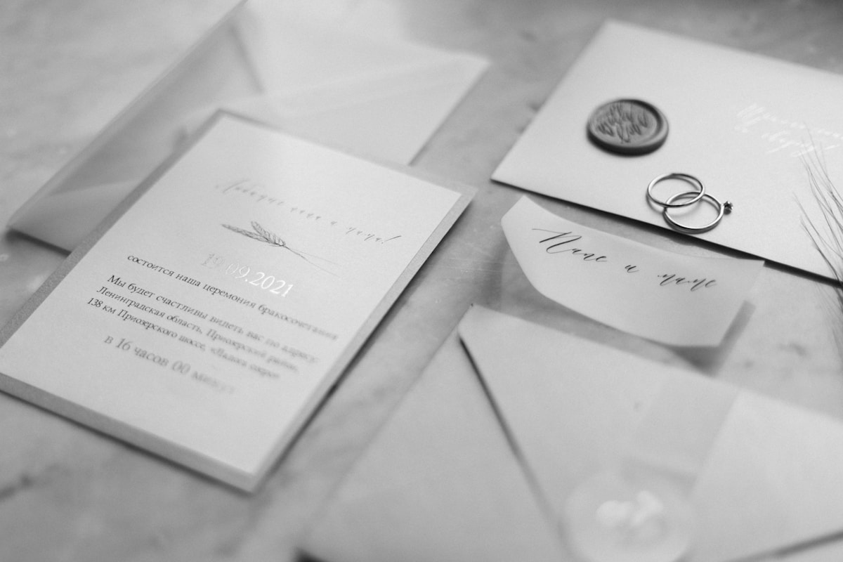
Classic wedding invitations use timeless design elements: script or serif fonts, monograms or crests, and formal wording such as “request the honor of your presence.” They favor neutral or jewel-tone palettes with foil, engraved-look printing, or letterpress texture over trendy graphics. The goal is an invitation that looks as elegant in twenty years as it does the day it arrives.
A monogram pressed into cream cardstock. A single line of script naming a date months away. A navy envelope sealed in wax. These details do not chase a trend, and that is the point of a classic invitation in the first place.
Couples who gravitate toward this style are usually planning a formal wedding, a ceremony in a house of worship, or simply a day they want to photograph well decades from now. Trend-driven invitations tend to date themselves fast. Classic ones rarely do.
This guide walks through 12 real invitation designs built around that classic look, then breaks down the wording, fonts, printing methods, and timeline that make a formal invitation feel correct rather than guessed at. By the end, you should be able to pick a design and write the wording for it with confidence.
What Makes a Wedding Invitation “Classic”
A classic invitation relies on a small set of design choices that have held up for decades: script or serif type, a monogram or family crest, a restrained color palette, and formal wording. Nothing about the format is loud. The elegance comes from proportion, spacing, and paper quality rather than bold graphics or photos.
Most couples who search for this style are not trying to recreate their grandparents’ wedding exactly. They want something that will not look dated in photographs 10 or 20 years from now, and that reads as intentional rather than trend-chasing. That is a different goal than picking the invitation that is most popular this season.
Fonts and Typography
Three type styles carry almost all classic invitation design: script, serif, and engraved-look printing.
- Script mimics handwritten calligraphy. It works best for names, monograms, or a single accent line, since long paragraphs in script slow readers down.
- Serif fonts, the kind with small feet on each letter, handle the bulk of the wording. They read as formal without feeling fussy.
- Engraved-look printing raises the ink slightly off the page, or presses letters into it, imitating the century-old technique of hand engraving on copper plates.
Pairing one script font for names with one serif font for the body text is the most common classic combination, and it rarely goes wrong. If you are choosing between two designs and cannot decide, checking whether the font pairing follows this rule is a fast way to settle it.
Color and Paper
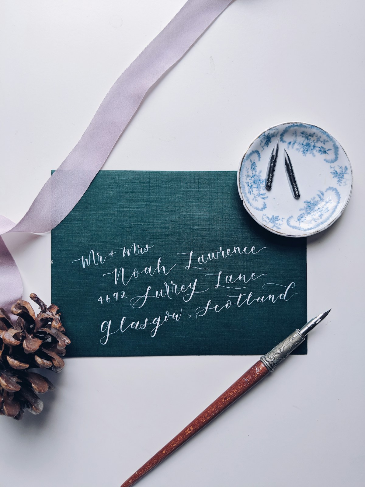
Ivory, cream, and black and white make up the core classic palette. Jewel tones such as navy, hunter green, and burgundy show up often too, usually paired with gold or silver foil rather than bright accent colors.
Paper texture matters as much as color. A linen finish, a slightly heavier cardstock, or a deckled edge all signal quality before a guest reads a single word. Holding two invitation samples side by side, one on standard cardstock and one on a heavier linen stock, usually settles the debate quickly.
Printing Techniques: Foil, Letterpress, and Engraving
Most invitation guides skip this part, but the printing method affects both how formal an invitation looks and how much it costs. Three techniques cover almost every classic option:
- Foil printing applies a thin layer of metallic foil, usually gold, silver, or rose gold, to the paper. It catches light and reads as formal without the cost of engraving.
- Letterpress presses inked type into thick paper, leaving a slight indentation you can feel with your fingers. It has a handmade, textural quality that digital printing cannot fully replicate.
- Engraving is the most traditional and most expensive method. Ink sits raised above the paper surface, produced from an etched metal plate. Many modern classic invitations use engraved-look digital printing to get a similar visual effect for less.
Foil, letterpress, and engraved-look printing are the three finishing techniques most associated with a traditional invitation feel. None is objectively better. The choice usually comes down to budget and how much texture you want a guest to notice when they open the envelope.
12 Classic Wedding Invitation Designs to Consider
The 12 designs below come from Joy’s invitation collection and cover the range of what “classic” can look like, from stark monograms to softer script treatments. You can browse invitation designs directly to see full suites, color options, and paper choices for any of them.
As you look through them, notice how each one leans on the same handful of elements, monogram, crest, script, restrained palette, but combines them differently depending on the mood of the wedding.
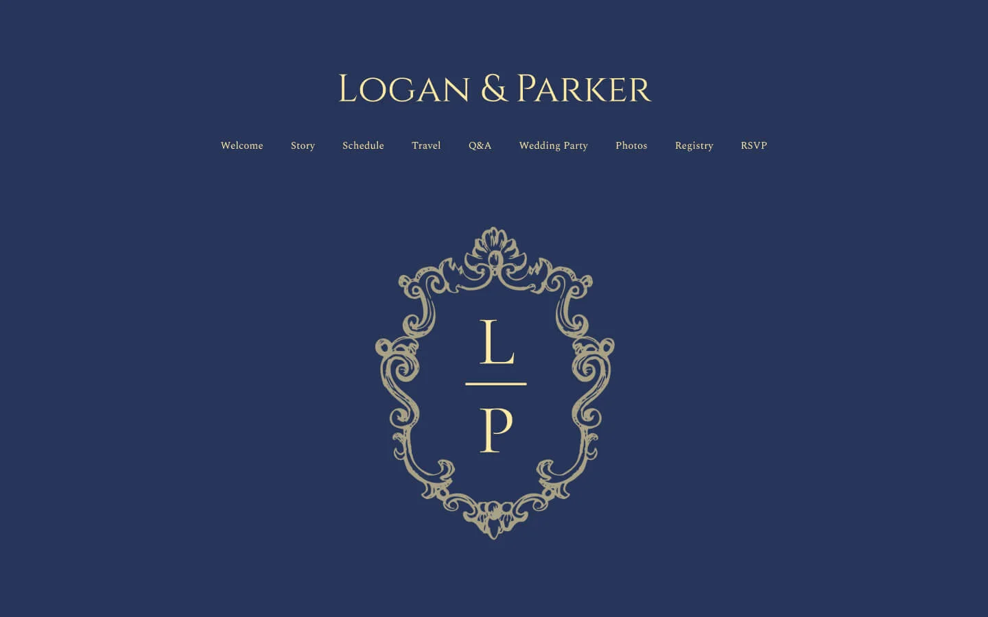
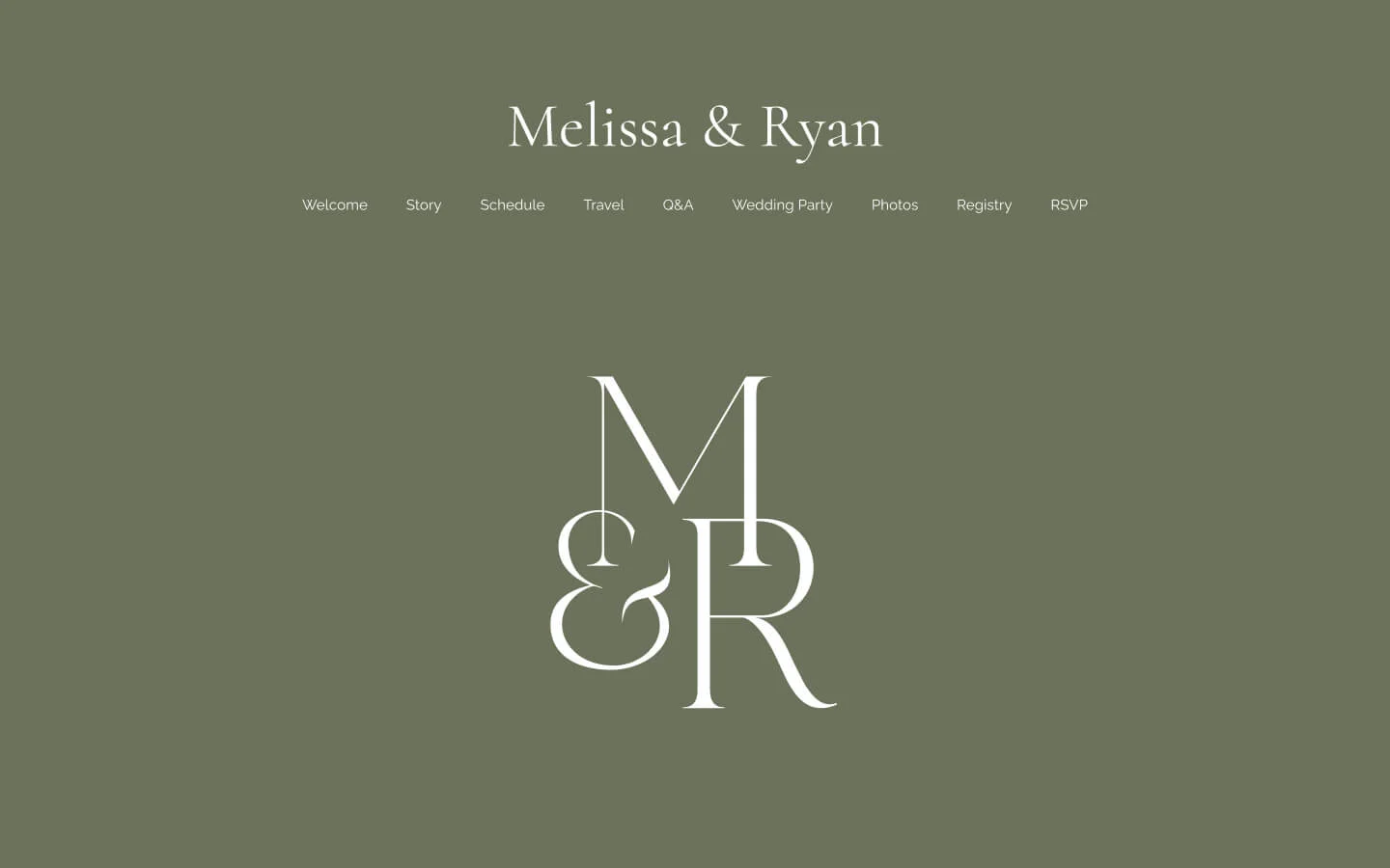
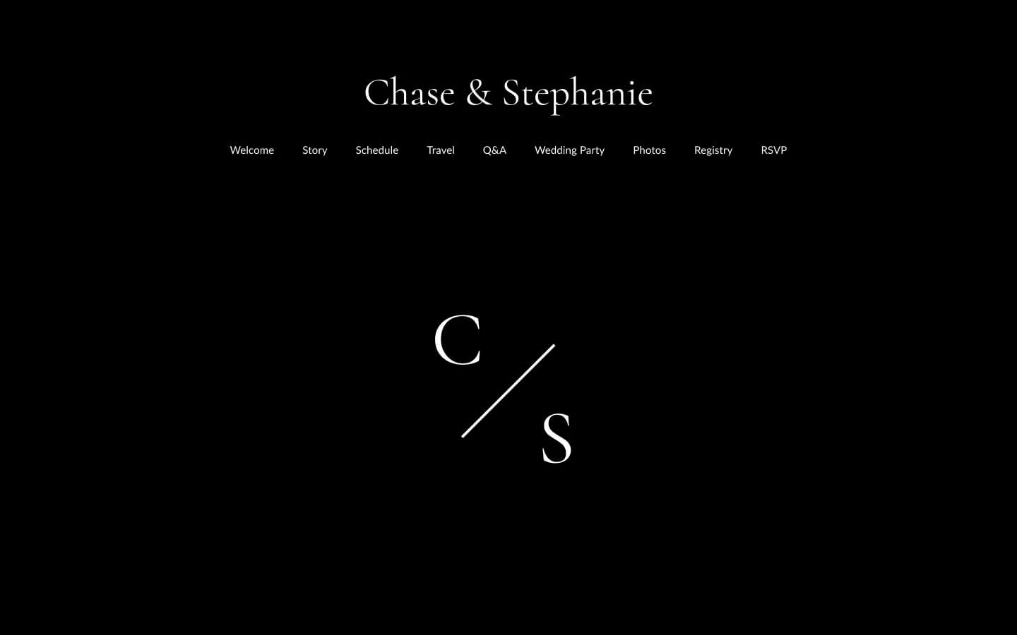
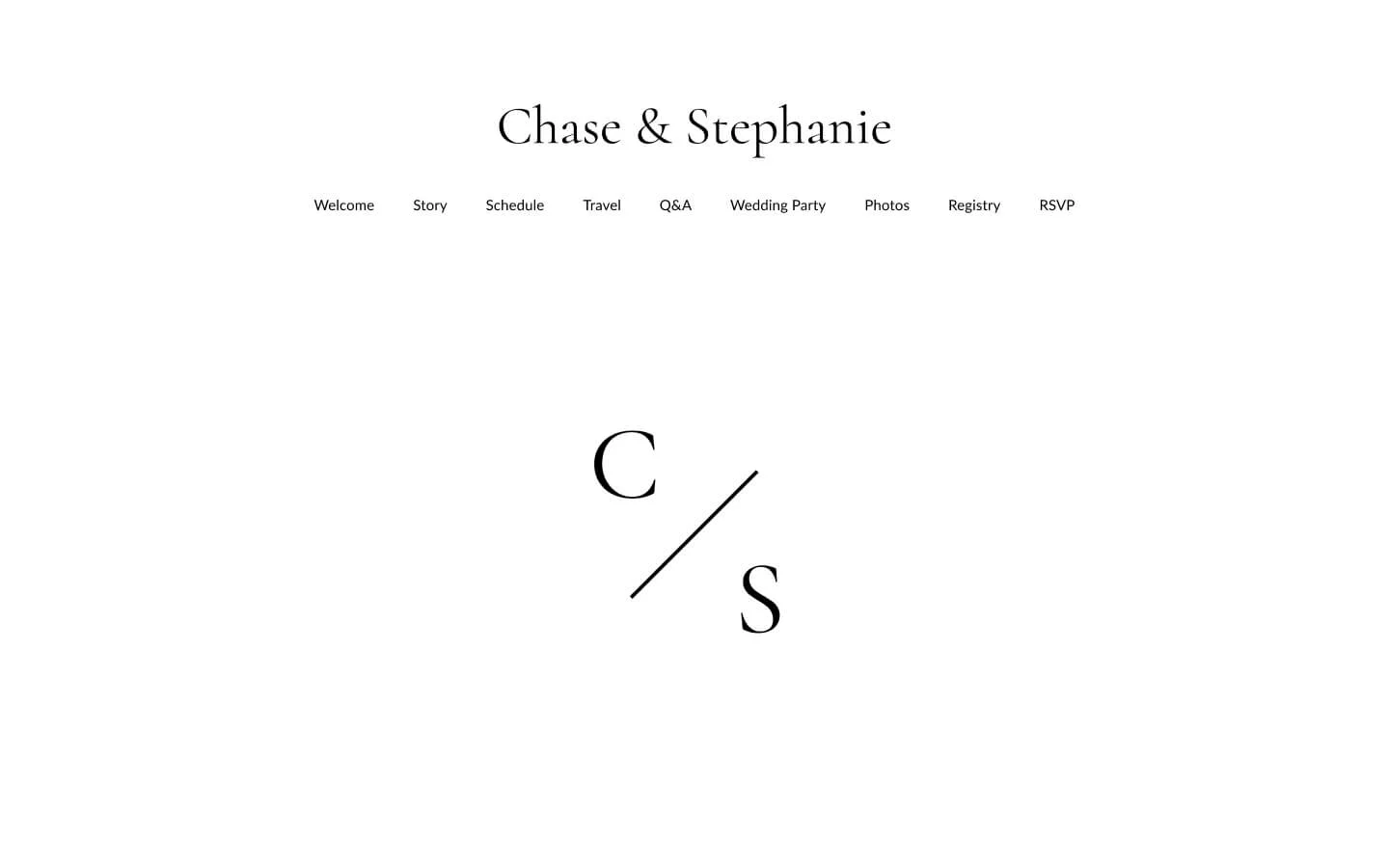
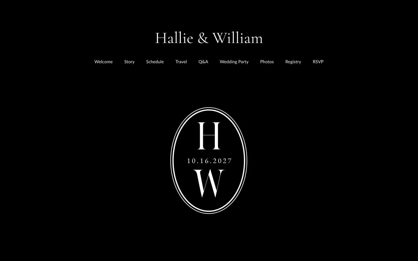
A monogram treatment and a full crest signal a similar level of formality, but a crest carries more visual weight. Choose a crest if you want the invitation to feel like a family heirloom, and a monogram if you want it to feel personal and current.
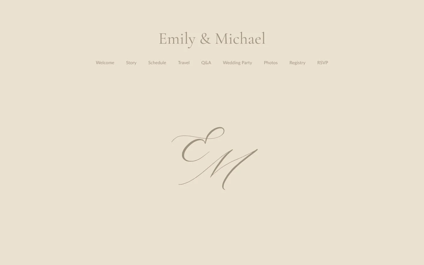
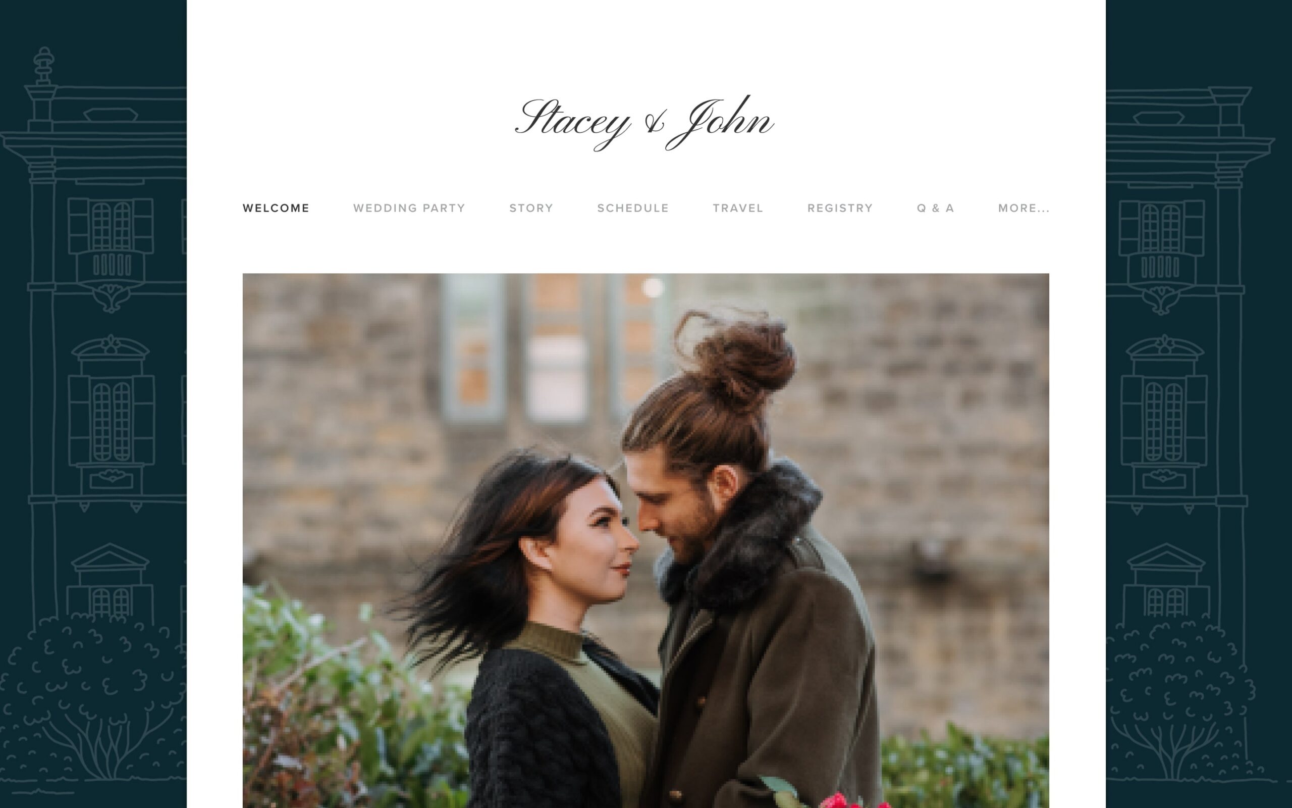
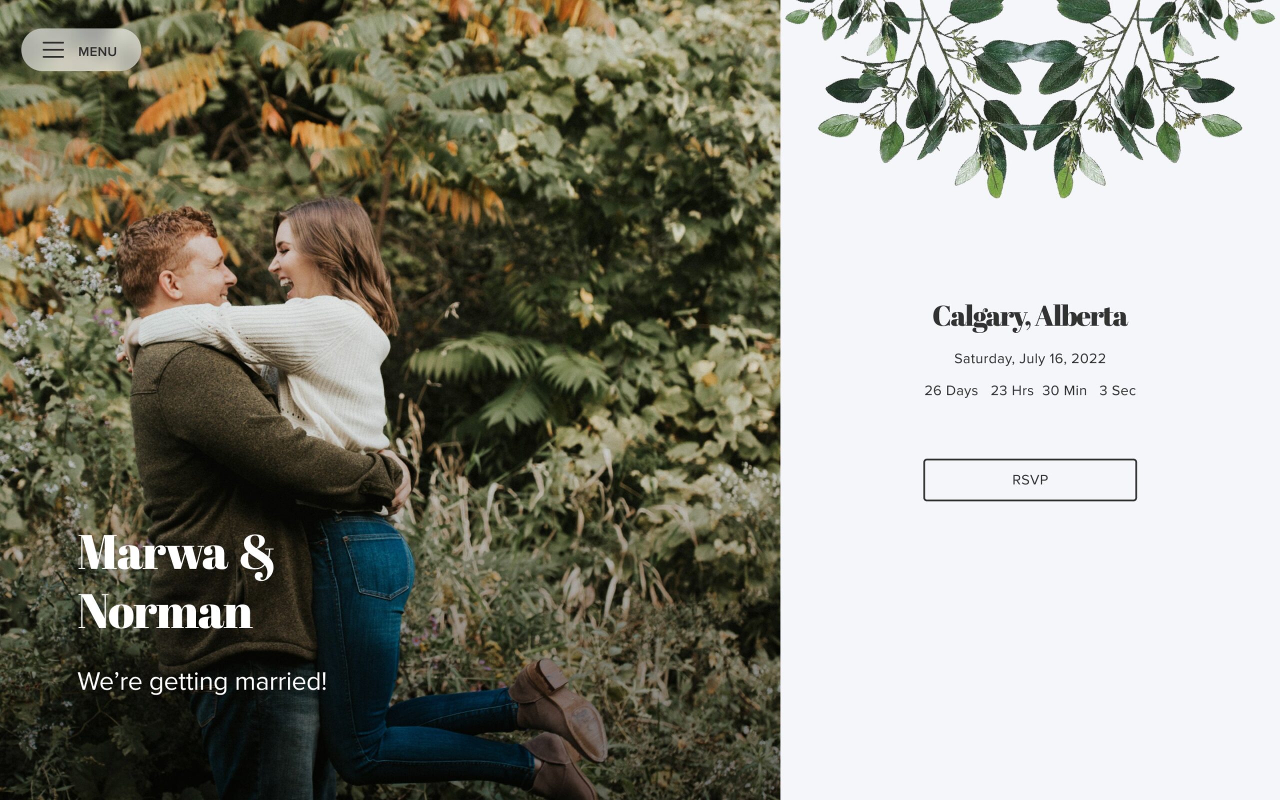
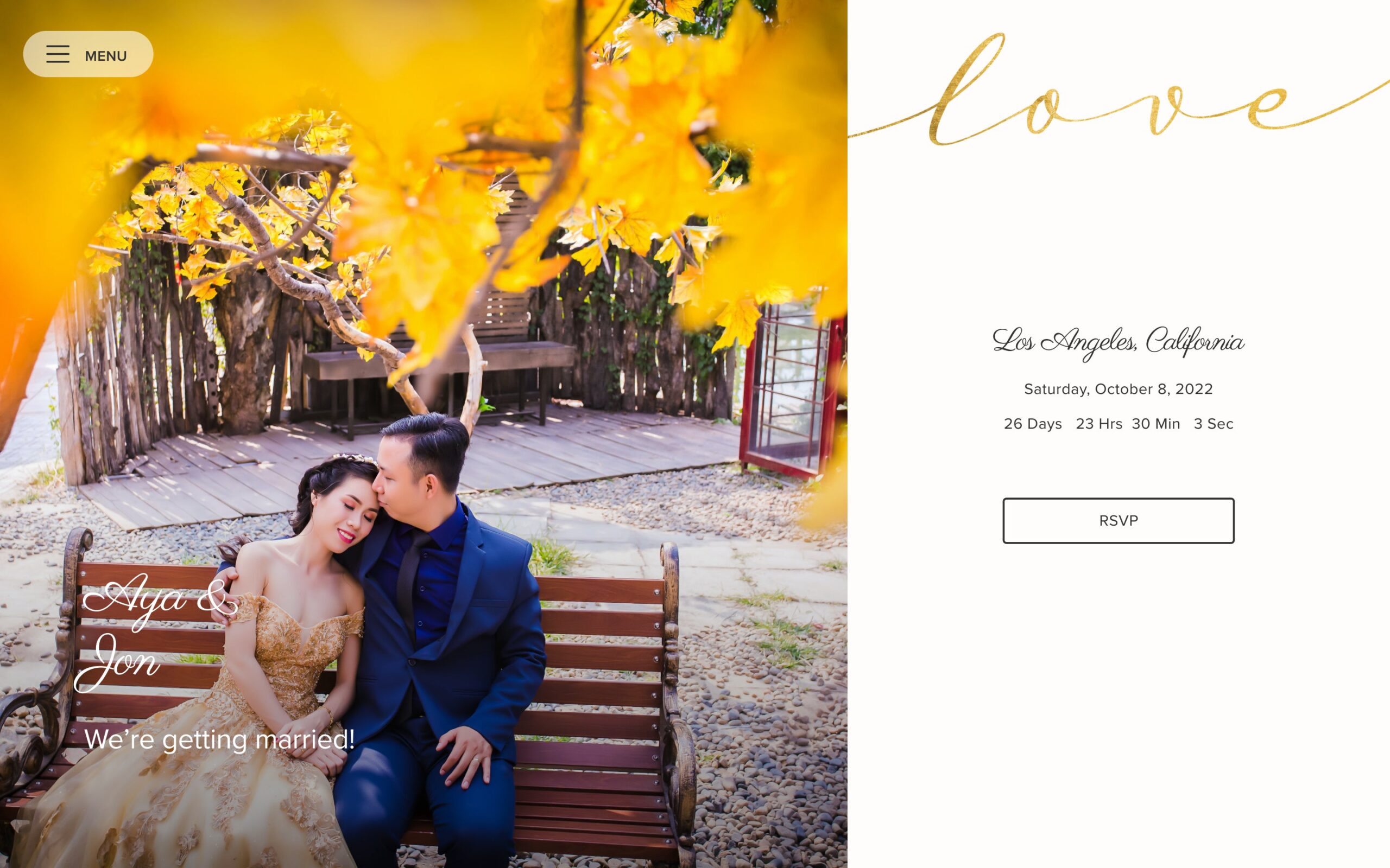
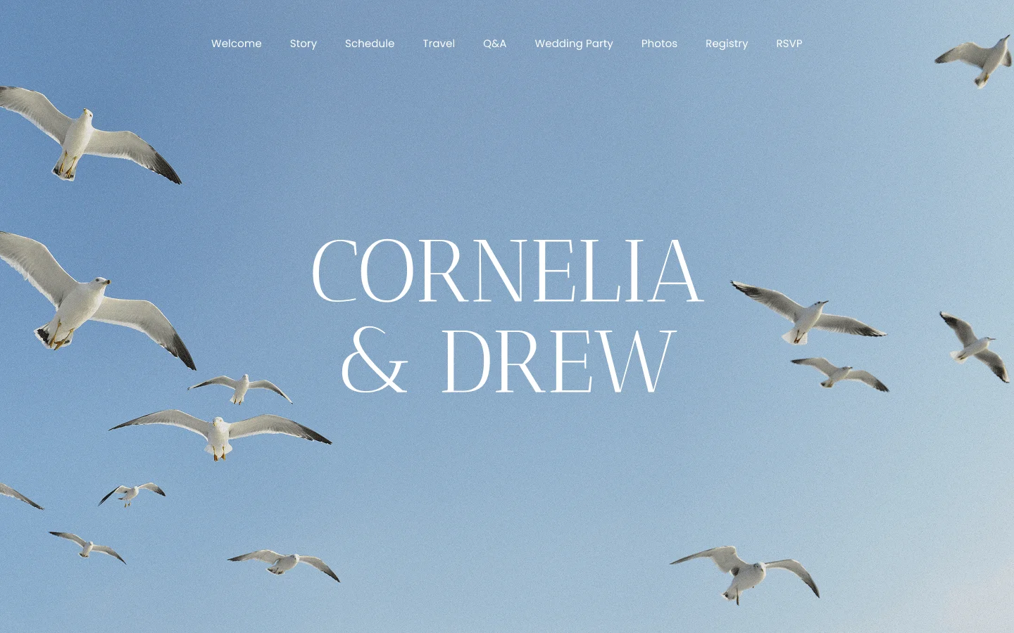
Notice the range between Estate Dark and Garden Estate. Both are formal, but the palette alone shifts the mood from evening manor house to daytime garden party.
Classic Wedding Invitation Wording, Explained
Wording is where most couples get stuck. Below is the structure that almost every formal invitation follows, broken into the parts you actually need to decide on. Read through all five once, then use the copy-paste template further down to draft your own.
Who Goes on the Host Line
The host line names whoever is issuing the invitation, traditionally the parents of the bride. Modern formal invitations often list both sets of parents, or the couple themselves if they are hosting. Some families choose to name only the parents who are contributing financially, while others list every parent regardless of who is paying, as a matter of courtesy.
There is no single correct answer, only the one that matches who is actually paying for and organizing the wedding. If parents are divorced and remarried, a wording specialist or your invitation designer can help you sequence names in a way that reads gracefully.
How to Word the Request Line
Two standard phrasings cover almost every formal invitation:
- “Request the honor of your presence,” used for ceremonies held in a house of worship.
- “Request the pleasure of your company,” used for ceremonies held anywhere else, including outdoor venues and event spaces.
This single word choice, honor versus pleasure, is one of the most consistent rules in formal invitation etiquette, and it is also one of the most commonly overlooked. Getting it right is a small detail, but it is the kind of detail that guests who know the etiquette will notice.
Whose Name Goes First
A classic wedding invitation almost always leads with a host line, a request line, then the couple’s names, in that order. Traditional etiquette places the bride’s name before the groom’s name. Many couples now decide name order based on flow, alphabetical order, or personal preference instead, and either approach reads as correct.
For same-sex couples, name order typically follows the same logic: alphabetical, whichever reads more naturally aloud, or simply personal preference. Formal wording rules were built around a bride-and-groom assumption, but the underlying structure, host line, request line, names, date, adapts easily.
Writing Out the Date and Time Correctly
Formal invitation wording spells out the time completely, for example “half past six in the evening,” rather than using numerals. The date is written the same way: “the twelfth of September” rather than “September 12th.” Numerals read as casual on a formal invitation, so avoiding them is a quick way to keep the whole piece consistent.
Where the Dress Code Goes
Dress code, when included, sits in the bottom corner of the invitation itself or on a separate details or reception card. Common formal dress code lines include “black tie,” “black tie optional,” and “formal attire.” Keep this line short and place it where it will not compete with the ceremony details for attention.
Copy This Wording Template
Here is a complete, formal wording example combining every element above into one block you can adapt directly:
Together with their families
Emma Grace Whitfield
and
James Robert Callahan
request the pleasure of your company
at the celebration of their marriage
Saturday, the twelfth of September
two thousand twenty-six
at half past six in the evening
The Grand Hall, Charleston, South Carolina
Reception to follow
Formal attire
Swap in your own names, date, venue, and hosts, and the structure holds. This is the exact skeleton every classic invitation in this article’s gallery is built to support, whether the design uses a monogram, a crest, or gold script.
Monograms and Crests: The Classic Signature
Several designs in the gallery above, Classical Crest Navy, Classic Monogram Black, Classic Monogram White, and Newport Monogram Black, lean on a monogram or crest as the central design element. Monograms and crests are the single most common design element that signals a classic, formal wedding invitation, more consistent than any specific font or color.
A monogram built from initials feels personal and slightly more modern. A full crest, with a shield shape or decorative border, feels closer to a family heirloom. Neither is more correct. The choice usually comes down to whether the invitation should read as “our wedding” or “our family’s wedding.”
Some couples reuse the same monogram across every piece of the wedding, invitation, programs, favors, and the wedding website, so it becomes a visual signature guests recognize before the day even starts. Others use it only on the invitation suite and choose a different motif for the reception. Both are common, and neither undermines the classic look.
Matching the Rest of Your Stationery Suite
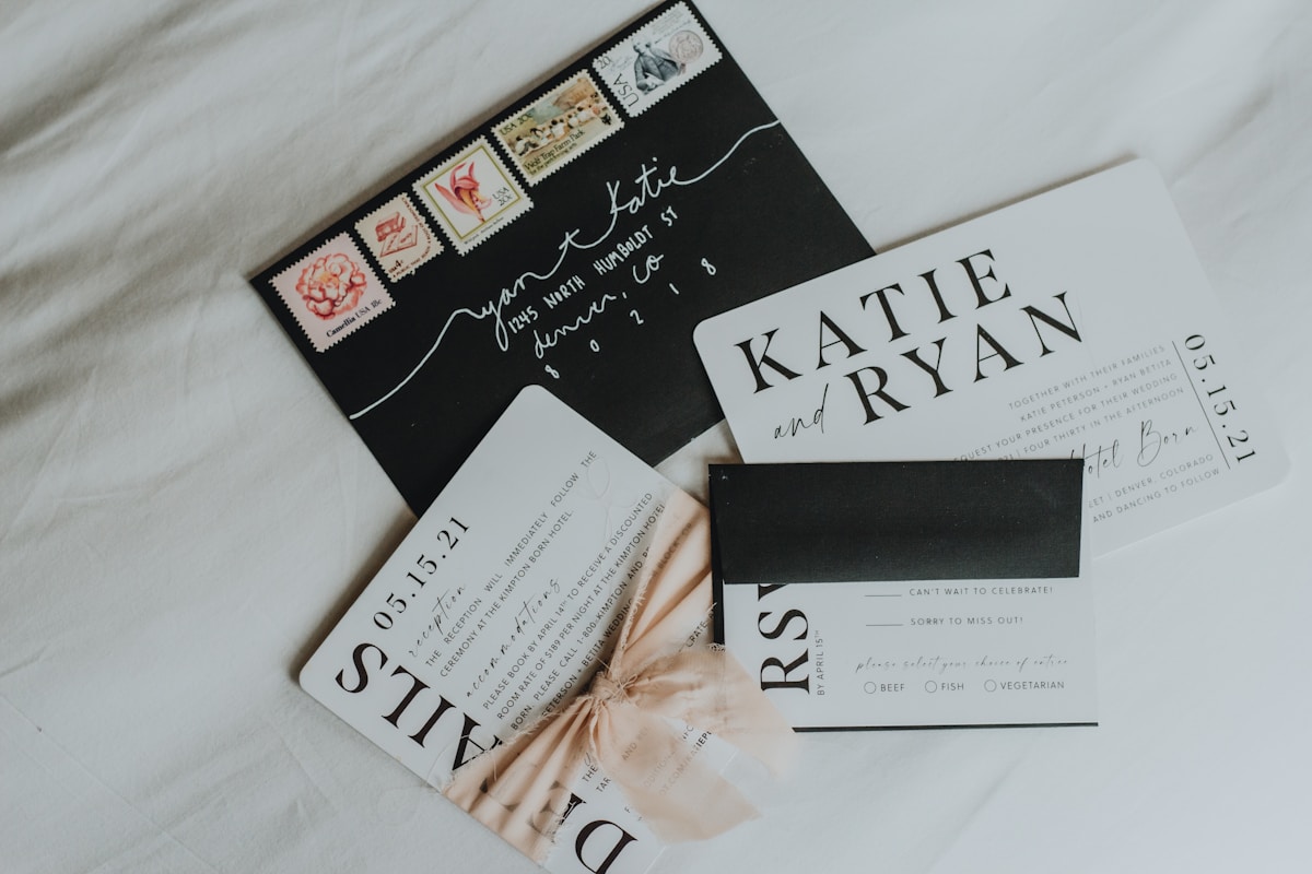
An invitation rarely travels alone. A complete classic stationery suite usually includes four pieces working as one coordinated system:
- RSVP card: A small reply card with a matching envelope, often postage-included.
- Enclosure or reception card: Details on the reception venue, timing, or additional events, kept separate so the main invitation stays uncluttered.
- Envelope liner: A patterned or colored liner inside the outer envelope, a small detail guests notice the moment they open the mail.
- Thank-you cards: Designed to match the invitation suite so the whole paper experience feels intentional from first mailing to last.
Designing all four pieces together, rather than picking them separately, is the easiest way to keep a classic look consistent. When you see coordinating invitation suites, look for the same font pairing, color palette, and paper stock repeated across every piece. A suite that mixes two unrelated fonts across the invitation and the RSVP card tends to look unplanned, even if each piece is well designed on its own.
Ordering the full suite at once, rather than adding pieces later, also tends to be more cost-efficient, since printing setup costs are shared across the whole run.
When to Order and Send Classic Wedding Invitations
Timing matters more for classic invitations than for casual ones, since custom printing methods take longer to produce.
- 4 to 6 months before the wedding: Order invitations, especially for custom engraving, letterpress, or foil work that requires production time.
- 6 to 8 weeks before the wedding: Mail invitations. For a formal wedding with many out-of-town guests, mailing closer to 8 weeks is the safer choice.
- 3 to 4 weeks before the wedding: Set the RSVP deadline, giving guests enough time to respond and giving you enough time to finalize headcounts with your venue and caterer.
Save-the-dates, if you send them, go out separately, typically 6 to 8 months before the wedding, well ahead of the invitations themselves. Destination weddings and holiday-weekend dates push every one of these windows earlier, since guests need more lead time to arrange travel.
Keeping a Classic Invitation Personal
Classic does not have to mean generic. The most common concern couples raise about this style is that it will feel stiff, or that guests will not be able to tell one formal invitation from another. A few specific, concrete choices solve that without breaking the format:
- Wax seal color: Choose a shade that matches your wedding palette instead of a default cream or white.
- A combined monogram: Build the initials from both partners’ names rather than using a single last-name letter.
- A family motif: Work in a subtle detail tied to a shared interest, a hometown landmark, or a family crest that already exists.
- A meaningful venue line: Note the venue name in full if it carries history for your family, rather than abbreviating it.
These choices add personality without breaking the formal structure that makes the invitation feel classic in the first place. A vague instruction like “make it yours” does not give you anything to act on. A specific choice, like a wax seal in your wedding’s exact shade of green, does.
A practical next step: once you have settled on wording and a design direction, keep the whole suite, invitation, RSVP, and enclosure card, in one place while you finalize details with your venue and vendors. Many couples find it easier to lock in a design once they can start designing their invitations alongside their guest list and RSVP tracking, so the wording on the invitation matches what guests see when they respond.
Frequently Asked Questions
What makes a wedding invitation classic instead of modern?
A classic wedding invitation relies on timeless elements: script or serif type, a monogram or crest, formal wording, and a restrained color palette. Modern invitations tend to use bold graphics, photos, or casual language instead.
How should a classic wedding invitation be worded?
Start with the host line, add a request line such as “request the honor of your presence” or “request the pleasure of your company,” then list the couple’s names, ceremony date, time, and location. Reception details usually go on a separate enclosure card.
How far in advance should classic wedding invitations be sent?
Most couples mail invitations six to eight weeks before the wedding, giving guests three to four weeks to RSVP. For a formal wedding with many out-of-town guests, mailing closer to eight weeks is safer.
Do classic invitations need a monogram?
No. A monogram is a popular classic touch, but a formal font pairing and traditional wording can look just as timeless without one.
Can a classic invitation still feel personal?
Yes. Couples can keep the formal structure and add a meaningful detail, such as a wax-seal color, a family crest, or a monogram built from both partners’ initials, without breaking the classic look.
Classic does not mean boring. It means choosing a design that will still feel right in your wedding album decades from now, whether that is a bold navy crest or a soft cream monogram. Take another look through the gallery above and browse invitation designs until one feels like it belongs to your wedding, not someone else’s.
